
TL;DR:
- Consistent stamp branding signals professionalism, building customer trust and increasing brand recognition.
- Implementing clear guidelines and regular quality checks ensures uniform impressions across all surfaces and touchpoints.
A single mismatched stamp on a parcel, invoice, or loyalty card can quietly signal to customers that your business lacks attention to detail. That impression costs you more than you might expect. Consistent branding boosts revenue by as much as 23%, yet many small business owners treat rubber stamps as an afterthought rather than a deliberate branding tool. This guide covers what stamp branding consistency actually means, what the evidence says, and how to apply it step by step across your retail or marketing operation.
Table of Contents
- What is stamp branding consistency and why does it matter?
- Key elements of consistent stamp branding
- How to implement and maintain stamp branding consistency
- Real-world examples: success stories and pitfalls in stamp branding
- Consistency is powerful, but only when it’s practical
- Take the next step: transform your brand with consistent stamps
- Frequently asked questions
Key Takeaways
| Point | Details |
|---|---|
| Consistency boosts sales | Uniform stamp branding can raise your revenue and customer trust significantly. |
| Brand guidelines matter | Written specifications for stamps help ensure every impression builds recognition. |
| Practicality over perfection | Professional consistency is more valuable than obsessing over minor design differences. |
| Routine audits are key | Regularly check your stamped materials to prevent errors and preserve your image. |
What is stamp branding consistency and why does it matter?
Before we examine how to create consistency, it’s vital to understand what it actually means and why every detail counts for your business.
Stamp branding consistency means using the same logo design, approved colours, specified font, size, and message across every stamp impression your business makes. Whether you are stamping a cardboard mailer, a loyalty card, an invoice, or a product tag, the result should look as though it came from the same source every single time. That sameness builds recognition. And recognition builds trust.
“Consistent branding including stamps boosts revenue by up to 23%, making it one of the highest-return, lowest-cost improvements a small retailer can make.”
The global rubber stamp market was valued at up to USD 2 billion in 2023, driven largely by small businesses investing in custom stamps for branding purposes. That figure reflects just how seriously businesses across the world are taking physical branding tools. Understanding the role of stamps in branding helps you see why this investment pays off over time.
The direct benefits of stamp branding consistency include:
- Customer trust: Uniform impressions signal professionalism and reliability.
- Brand recognition: Repeated exposure to the same logo and design builds memory.
- Reduced confusion: Customers are not left guessing whether they are dealing with the same business.
- Operational efficiency: Standardised stamps speed up fulfilment and packaging workflows.
- Professional appearance: Clean, consistent impressions elevate perceived product quality.
- Scalability: As your business grows, consistent stamp guidelines transfer easily to new staff and new locations.
The good news is that building brand identity with stamps does not require a large budget. A well-chosen custom rubber stamp used consistently will outperform an expensive but poorly managed branding effort. For small retailers, in particular, stamps are one of the most affordable ways to achieve the same visual discipline that larger brands invest significantly to maintain. Knowing how to advertise your store consistently means treating every physical touchpoint, including stamps, as part of the same unified message.
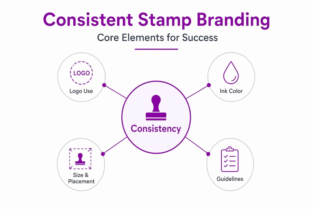
Key elements of consistent stamp branding
Now that we know the ‘why’, let’s break down exactly what elements you need to control for true branding consistency with stamps.
The following table summarises the core elements you must manage to achieve consistency:
| Element | What it means for stamps | Why it matters |
|---|---|---|
| Logo usage | Identical artwork used on every stamp order | Prevents design drift between versions |
| Approved fonts | Same typeface and weight across all stamps | Maintains visual coherence |
| Signature colours | Consistent ink colour matched to brand palette | Reinforces brand recognition |
| Alignment | Logo and text placed in standard position | Creates a predictable, professional impression |
| Stamp size | Standardised dimensions for each use case | Ensures proportions match the surface area |
| Relief depth | Consistent engraving depth for clean impressions | Prevents faint or over-inked results |
Following a structured rubber stamp design guide makes it far easier to control each of these elements before you place an order.
Here are the steps for establishing consistency across your stamps:
- Choose a single approved design. Lock in your logo artwork and confirm it is high-resolution and print-ready before ordering any stamp.
- Set written specifications. Record the exact dimensions, font names, ink colours (using Pantone or CMYK references), and relief depth for every stamp type you use.
- Document in a stamp brand guide. A short, written document, even one page, that outlines all approved stamp specifications for your team.
- Test impressions on all surfaces. Cardboard, paper, fabric, and card all absorb ink differently. Test before full adoption.
- Train all staff who use stamps. Show employees the correct pressure, angle, and re-inking frequency to maintain impression quality.
- Review outputs regularly. Build a simple spot-check into your weekly workflow to catch inconsistencies early.
Brand guidelines for stamps should specify fonts, colours, and sizes in the same way general branding guidelines do, but adapted for the physical realities of rubber stamps, including relief depth and ink performance on different materials.
Reviewing custom stamp best practices and following a reliable logo stamp tutorial before placing your first order will save you from the most common pitfalls.
Pro Tip: Digital logos often contain gradients or very fine lines that do not translate well to rubber. When adapting your digital brand guide for physical stamps, simplify artwork so every line is at least 0.8mm thick and remove any gradients entirely. A clean simplified version of your logo will produce sharper, more consistent impressions across all surfaces and ink types.
Common pitfalls include ordering stamps from different suppliers without checking artwork consistency, using slightly different logo versions across stamp types, and failing to account for ink bleed on absorbent surfaces. Each of these issues is avoidable with a written guideline and a brief pre-order review process.
How to implement and maintain stamp branding consistency
Identifying the key elements is only half the battle; here’s how to actually achieve and sustain consistency in the real world.
Follow these numbered steps to put your stamp consistency plan into practice:
- Write your stamp brand guidelines. Include approved artwork files, ink colours, stamp dimensions, and surface notes. Store the document where all relevant staff can access it.
- Brief every employee who handles stamps. A short five-minute session covering correct technique, ink maintenance, and the approved design is usually sufficient.
- Conduct regular spot-checks. Pull sample impressions from each stamp in use, weekly if possible, and compare them against your approved standard. Look for fading, misalignment, or ink build-up.
- Update guidelines after any rebrand or design change. Outdated stamps still in use after a logo update are one of the fastest ways to confuse customers.
- Include stamp standards in your supplier and new-staff onboarding. Anyone who orders, stores, or uses stamps should receive a copy of your guidelines on their first day.
The following table compares digital and physical branding guidelines to highlight where physical realities require extra attention:
| Aspect | Digital branding | Physical stamp branding |
|---|---|---|
| Colour accuracy | Managed by hex or RGB codes | Affected by ink type and surface porosity |
| Logo size | Scales infinitely | Fixed by stamp dimensions |
| Consistency control | Enforced by templates and files | Requires staff training and spot-checks |
| Reproduction speed | Instant | Depends on re-inking frequency |
| Quality drift | Rare with locked files | Common without regular audits |
| Legal relevance | Covered by copyright | Branding guides can evidence trademark use in legal contexts |
Understanding how to choose the right rubber stamp for each use case is a practical first step. Different surfaces and tasks require different stamp types, and using the correct stamp reduces the risk of inconsistent impressions. Once you have the right tools, the next priority is boosting branding with stamps by applying them methodically across every customer touchpoint.
Pro Tip: Build a physical audit sheet that sits near your stamp storage area. Staff can tick off a quick checklist each time they re-ink or swap out a stamp pad. This simple habit catches quality issues before they reach customers and creates an easy record if you ever need to evidence consistent branding in a legal or commercial context.
When looking to optimise retail offers, physical brand touchpoints like stamps contribute to the overall coherence customers experience. Consistency at every level, including the small details, supports stronger conversion and repeat business.
Real-world examples: success stories and pitfalls in stamp branding
To see these principles in action, let’s examine what works and what doesn’t through real business examples.
The global rubber stamp market reaching USD 2 billion reflects a global movement among small businesses to take physical branding seriously. Behind that number are thousands of retail and service businesses that have made stamp consistency a deliberate strategy rather than an accident.
Business wins from consistent stamp branding:
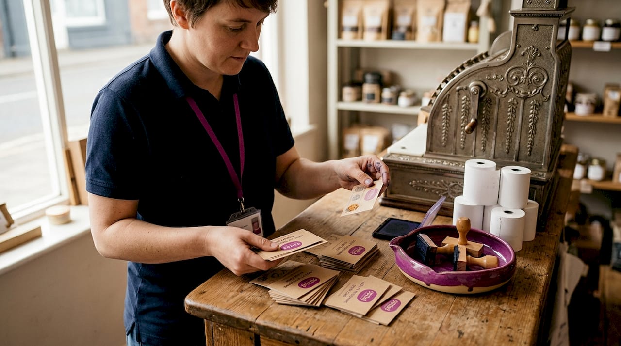
- A stationery retailer standardised its logo stamp across all packaging and saw customer recall improve noticeably within six months, measured through repeat purchase rates.
- A small bakery used a single loyalty stamp design consistently across all cards and reported that customers engaged more readily with the programme because they recognised the mark immediately.
- An independent clothing boutique unified its product tags, tissue paper stamps, and receipt endorsement stamps with one approved design, reducing the number of customer queries about whether items were genuinely from the same brand.
- A craft supplier that consolidated all stamp designs into a single approved version cut re-order confusion in half and reduced time spent briefing new staff on which version to use.
Pitfalls from inconsistent stamp use:
One boutique fashion retailer ordered stamps from three different suppliers over two years without checking artwork files. The result was three slightly different versions of the same logo in circulation at once, each using a marginally different font weight and size. Loyal customers noticed. Several mentioned it in online reviews, questioning whether the business had changed ownership. The retailer spent the equivalent of a modest marketing budget correcting the issue and re-ordering to a single approved standard.
A food and gift shop used two different ink colours on the same loyalty card design across different shop assistants’ stations, neither of which matched the brand’s signature colour. Customers held up different cards and asked staff why they looked different. The confusion undermined confidence in the loyalty scheme and contributed to lower redemption rates.
These are not dramatic failures. They are the kind of slow-burn errors that are easy to overlook but costly over time. Following practical branding steps from the outset prevents this pattern entirely. Reviewing unique stamp examples from comparable businesses can also show you how much is achievable with a well-defined stamp design approach. Looking at smart product bundling tips alongside your stamp strategy can help you see how physical branding tools reinforce perceived value across your full product range.
Consistency is powerful, but only when it’s practical
There is a tendency, particularly among business owners who have just discovered the revenue impact of consistent branding, to treat every millimetre of a stamp impression as a critical variable. That approach creates more problems than it solves.
The reality is that a 100% match between a digital logo and a stamped impression is not always achievable, and it is rarely necessary. Rubber behaves differently from pixels. Ink spreads slightly on absorbent surfaces. Pressure varies between users. Accepting a small, controlled margin of natural variation is not a failure of brand discipline; it is an honest acknowledgement of how physical tools work.
Over-engineering your stamp consistency, for example spending time endlessly adjusting artwork by half a millimetre or ordering dozens of test impressions to match a specific Pantone swatch, rarely produces a customer-visible result. Customers do not compare your stamp impression to a colour guide. They notice whether the impression looks clean, professional, and intentional.
The practical standard to aim for is professional enough, not perfect. Your stamp should look like it belongs to the same brand as your signage, packaging, and website. It should be clean, legible, and reliably applied. That goal is achievable without obsessive adjustment. Reviewing custom logo stamp uses across different touchpoints can help you prioritise where consistency matters most and where a reasonable standard is sufficient.
Consistency should serve your mission to build customer trust and recognition. When it starts to consume disproportionate time or budget, it has crossed from asset to obstacle.
Take the next step: transform your brand with consistent stamps
The right tools make maintaining stamp branding consistency almost effortless. Here’s where to start.
StampDesign4U offers a range of custom stamp options built specifically to help small businesses achieve reliable, professional impressions every time.
The Trodat 9-line logo stamp is a versatile option for businesses that need a consistent logo impression on packaging, invoices, and correspondence. For retail businesses running loyalty programmes, the Traxx loyalty stamp provides a compact, durable solution that stamps the same clean design every time. If you need a quick verification or approval mark, the personalised tick stamp is a simple, branded option. Browse the full range and contact the team for design consultation to ensure your brand guidelines translate directly into a precise, ready-to-use stamp.
Frequently asked questions
How can I make sure my stamp matches my digital brand exactly?
Draft brand guidelines specifying logo, colour, size, and font, then order test impressions and adjust until your stamp closely reflects your digital brand. Stamp brand guidelines should be adapted for physical realities like relief depth, not just copied from digital style guides.
What are the most common mistakes in stamp branding?
The most frequent errors are inconsistent logo placement, using unapproved colours, or not testing stamp impressions on all surfaces used in the business. Simple testing and reliable impression standards prevent most of these issues before they reach customers.
How often should I review my stamp branding for quality?
Audit your stamp impressions monthly and immediately after any changes to your visual branding to maintain consistency. Short spot-checks take only a few minutes but catch quality drift before it becomes visible to customers.
Does consistent stamp branding really help my sales?
Yes. Consistent branding boosts revenue by as much as 23%, and stamps are one of the most cost-effective physical tools for achieving that consistency across multiple customer touchpoints.
Recommended
- Business branding with stamps: Practical steps for small businesses – Stamp Design 4U
- Custom Logo Stamps: Why They Matter for your Brand Identity – Stamp Design 4U
- Streamline your workplace stamp design for branding success – Stamp Design 4U
- Multi-design stamping: boost your branding today – Stamp Design 4U