
TL;DR:
- Proper file preparation, especially using vector formats and outlined text, ensures stamp clarity and quality.
- Adequate spacing and avoiding fine detail prevent ink bleed and illegibility in stamp impressions.
- Establishing a documented workflow for stamp design and reordering maintains brand consistency over time.
A stamp impression that fails to reproduce your logo clearly is not just a visual nuisance. It wastes materials, delays workflows, and sends the wrong message to clients and colleagues who receive your correspondence. Stamp legibility issues such as excessive fine detail, thin fonts, and incorrect file types can degrade or shift a design entirely during production, turning a well-considered branding asset into an unreadable mark. This guide walks through the full process, from file preparation to final verification, so your workplace stamp is consistent, legible, and ready to represent your brand on every impression.
Table of Contents
- What you need before you start
- Step-by-step: How to design a workplace stamp
- Common mistakes and troubleshooting
- Verifying your stamp design before production
- Why the stamp design process matters more than you think
- Get started with professional stamp design solutions
- Frequently asked questions
Key Takeaways
| Point | Details |
|---|---|
| Use vector files | Vector artwork (AI, EPS, SVG) ensures clear, sharp stamp impressions every time. |
| Simplify design elements | Avoid fine details and thin fonts, as these rarely transfer well during stamping. |
| Leave breathing room | Space out elements in your stamp design to reduce ink bleed and boost legibility. |
| Test before producing | Always review a test impression to catch errors before final production. |
| Follow a systematic process | A repeatable method minimises mistakes and delivers consistent, professional results. |
What you need before you start
Understanding the risks of a poorly prepared file is the first step. Knowing exactly what you need before touching any design software is the second. Skipping this stage is where many businesses lose time and money.
Essential files and tools
Before opening any design application, gather the following:
- Your logo in vector format (AI, EPS, or SVG). Vector files scale without losing quality, which makes them far superior to raster formats such as PNG or JPG for stamp production.
- Brand fonts, ideally in a format your design software can read natively.
- Brand colour reference (CMYK or Pantone codes). Even though most stamps print in a single ink colour, knowing your brand palette helps you make accurate design decisions.
- Clear specification of stamp size, usually supplied in millimetres by the manufacturer or supplier.
Stamp design file standards confirm that using vector files such as AI, EPS, or SVG and converting text to outlines are non-negotiable starting points for reliable stamp reproduction. Understanding logo stamp creation basics will give you further context on why file choice shapes the final result.
File format comparison
| Format | Type | Suitable for stamps | Notes |
|---|---|---|---|
| AI | Vector | Yes | Industry standard for design software |
| EPS | Vector | Yes | Widely accepted by manufacturers |
| SVG | Vector | Yes | Scalable, open format |
| PNG | Raster | No | Loses quality when scaled |
| JPG | Raster | No | Compression causes edge blurring |
| Mixed | Sometimes | Only if saved from a vector source |
Fonts and minimum size guidance
Fonts with very thin strokes, or typefaces classified as “hairline” or “ultralight,” are a recurring cause of failed stamp impressions. The ink spreads slightly on contact with paper, which means thin strokes either disappear or fill in unpredictably. A safe minimum stroke width is roughly 0.5mm. For text, a minimum of 8pt is a reasonable baseline, though 10pt or above is more reliable in practice.
Branding with custom stamps requires that your font choices translate well to a single-colour impression. Bold, clean typefaces such as sans-serifs consistently outperform decorative scripts at small sizes.
What is ‘breathing room’ and why does it matter?
‘Breathing room’ refers to the empty space left around each design element within your stamp layout. When ink transfers from rubber to paper, it spreads slightly beyond the intended mark. If two elements are too close together, the ink bleeds between them, making the design look smudged or illegible. A general rule is to leave at least 1mm of clear space around each element, and more where possible.
Pro Tip: Before submitting your file, zoom into your design at 200% and look for any elements that appear to touch or overlap. Separate them with at least 1mm of breathing room, then convert all text to outlines so no font substitution can occur during production.
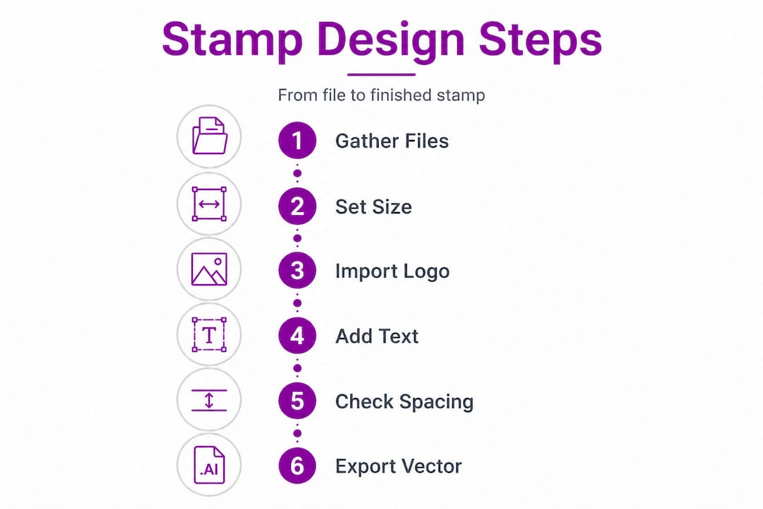
Step-by-step: How to design a workplace stamp
After gathering the right materials, the actual design process follows a clear sequence. Each step builds on the last, and skipping any one of them introduces risk.
Step 1: Set up your document to the correct stamp size
Open your design software and create a new document that matches the finished stamp dimensions exactly. Work in millimetres, not pixels, to avoid confusion between screen resolution and physical size. Designing at actual size means what you see on screen is what will be produced.
Step 2: Import and simplify your logo
Place your vector logo file into the document. Immediately assess whether it contains fine details, gradients, or photographic elements. Gradients and photographs cannot be reproduced on a rubber stamp. Simplify the artwork to a clean, flat, single-colour version. Remove any shadows, highlights, or subtle outlines that will not survive the stamp production process.
Step 3: Add your text elements
Type any required text, such as your business name, address, or contact details, using a bold, legible font. Keep the point size at or above 8pt, and favour heavier weights over light ones. Once you are satisfied with the layout, convert all text to outlines (also called “creating outlines” in Adobe Illustrator). This step, outlined in stamp production guidance, prevents font substitution if the file is opened on a machine that does not have your chosen typeface installed.
Step 4: Check spacing and breathing room
Review every element for adequate breathing room. Ensuring enough breathing room to avoid ink bleed in tight spaces is one of the most commonly overlooked steps, yet it has a direct impact on legibility. Increase spacing between lines of text, between the logo and surrounding text, and between the design and the stamp border.
Step 5: Export in the correct format
Save or export the final file in an accepted vector format. If the manufacturer requires a PDF, ensure it is saved with vector data intact, not flattened to a raster image. Confirm with your supplier which formats they accept before finalising.
Digital design vs physical proofing
| Method | Advantages | Limitations |
|---|---|---|
| Digital proof (on screen) | Fast, free, easy to share | Colours may not reflect single-colour output |
| Printed proof (laser or inkjet) | Shows approximate scale and layout | Does not replicate ink spread |
| Physical test stamp | Most accurate representation | Requires production of a test unit |
Pro Tip: Print your design at 100% scale on standard paper and hold it up to the light. Squint slightly to simulate how the design will look as a stamp impression. Anything that disappears or blurs at this stage will likely cause problems in production.
For a more detailed walkthrough, the logo-to-stamp guide and the company logo stamp tutorial both provide useful reference points for this stage.
Common mistakes and troubleshooting
Proper execution reduces errors, but knowing what goes wrong is equally important. Even experienced designers make predictable mistakes when working with stamp files for the first time.
Mistakes that undermine stamp clarity
- Excessive fine detail in logos. Intricate illustrations, crosshatching, and small icons that look sharp on a business card do not transfer reliably to a rubber stamp. Design errors including fine detail, thin strokes, and non-matching file types can degrade or shift the entire design during production.
- Thin or lightweight fonts. Hairline typefaces fill in or vanish under ink spread. Switch to a medium or bold weight of the same font family to preserve legibility.
- Raster images in place of vectors. A PNG or JPG placed into a vector file does not become a vector. It remains a raster image and will produce blurred or pixelated edges in the final stamp.
- Failing to outline text. If text is not converted to outlines before submission, font substitution can occur at the production stage. This shifts letter shapes, spacing, and line breaks, sometimes making the stamp unreadable.
- Ignoring the stamp border. Many designs push text or logo elements too close to the outer edge. This risks elements being cut off or falling outside the printable area of the stamp die.
Quick fixes for common problems
A legible stamp is a simple stamp. If you cannot read your design clearly at actual size on a white background, neither will the person receiving the impression. Simplify first, add detail second.
Review your artwork against these fixes before submission:
- Replace thin fonts with a bolder variant or increase the stroke weight.
- Remove or redraw fine detail in the logo so it reproduces as a clean silhouette.
- Re-source your logo in vector format from your brand guidelines or designer rather than exporting from a website.
- Outline all text before saving the final file.
- Add a 1mm buffer around all elements and from the stamp border.
The custom stamp best practices resource covers these points in further detail, particularly for businesses managing multiple stamp designs across departments.
Verifying your stamp design before production
Once errors have been addressed, it is time to verify your final design for flawless production. This stage functions as a quality gate. Passing it properly means fewer reprints and a stamp that serves your brand reliably for years.
Verification checklist
Work through this sequence before submitting any file to a manufacturer or online supplier:
- Confirm the file format. Is the file saved as AI, EPS, SVG, or a vector-origin PDF?
- Check all text is outlined. Select each text element and confirm it shows as a path, not an editable text box.
- Measure breathing room. Use your design software’s ruler tool to confirm at least 1mm of space around each element. Breathing room to avoid ink bleed in tight spaces is a non-negotiable checkpoint.
- Review at actual size. Set your document view to 100% and assess legibility without zooming in.
- Check stroke weights. Any stroke below 0.5mm is likely to cause problems. Increase it or remove it.
- Verify dimensions match the ordered stamp size. A design prepared for a 60mm x 40mm stamp cannot simply be scaled to 30mm x 20mm without reviewing all element sizes and spacing again.
- Compare against brand guidelines. Does the font match? Is the logo in its approved single-colour form? Is spacing consistent with how the brand is represented elsewhere?
Signs a file is ready to produce
- All text appears as outlines (paths), not editable type.
- No raster images are embedded in the file.
- All elements are clearly separated with adequate breathing room.
- The design reads clearly when printed at 100% scale on plain paper.
- Stroke weights are at or above 0.5mm throughout.
- The file dimensions match the stamp specification exactly.
The design workflow for stamps and the company stamps for branding guides both offer practical context for integrating this verification stage into a repeatable internal process.
Why the stamp design process matters more than you think
Most guides stop at “get the right file format and you’ll be fine.” That advice is not wrong, but it misses the larger point. The real value of a well-structured stamp design process is not the individual stamp. It is the system that produces consistent stamps, across every department, every reorder, and every future rebrand.
Many businesses treat each stamp as a one-off project. A team member downloads a logo, guesses the size, and submits a file that vaguely resembles the brand. The result is a collection of stamps that each look slightly different. Over time, this inconsistency signals carelessness to clients. It is a small detail, but small details accumulate.
The smarter approach is to treat your stamp design process exactly as you would any other brand asset production workflow. Document which logo version to use, which font settings to apply, which file format to submit, and which supplier to contact. Store the final approved file in a shared location that anyone can access when the stamp needs reordering. This single step eliminates the most common source of stamp design errors: starting from scratch every time.
Why custom logo stamps matter for brand identity goes beyond aesthetics. A stamp that consistently delivers a clean, clear impression reinforces professionalism on every piece of physical correspondence, packaging, or document it touches. That consistency builds familiarity, and familiarity builds trust.
There is also a counterintuitive truth worth stating plainly: a perfectly designed stamp that cannot be easily reordered by your team is less valuable than a very good stamp attached to a clear, documented process. Repeatability outperforms perfection every time.
Pro Tip: After your first stamp order is complete and approved, create a one-page internal document that records the file name, format, supplier, stamp dimensions, and any notes from the production process. The next person who needs to reorder or update that stamp will thank you for it.
Get started with professional stamp design solutions
If the process outlined above feels like a lot to manage alongside your existing workload, that is exactly where a specialist stamp design service adds value.
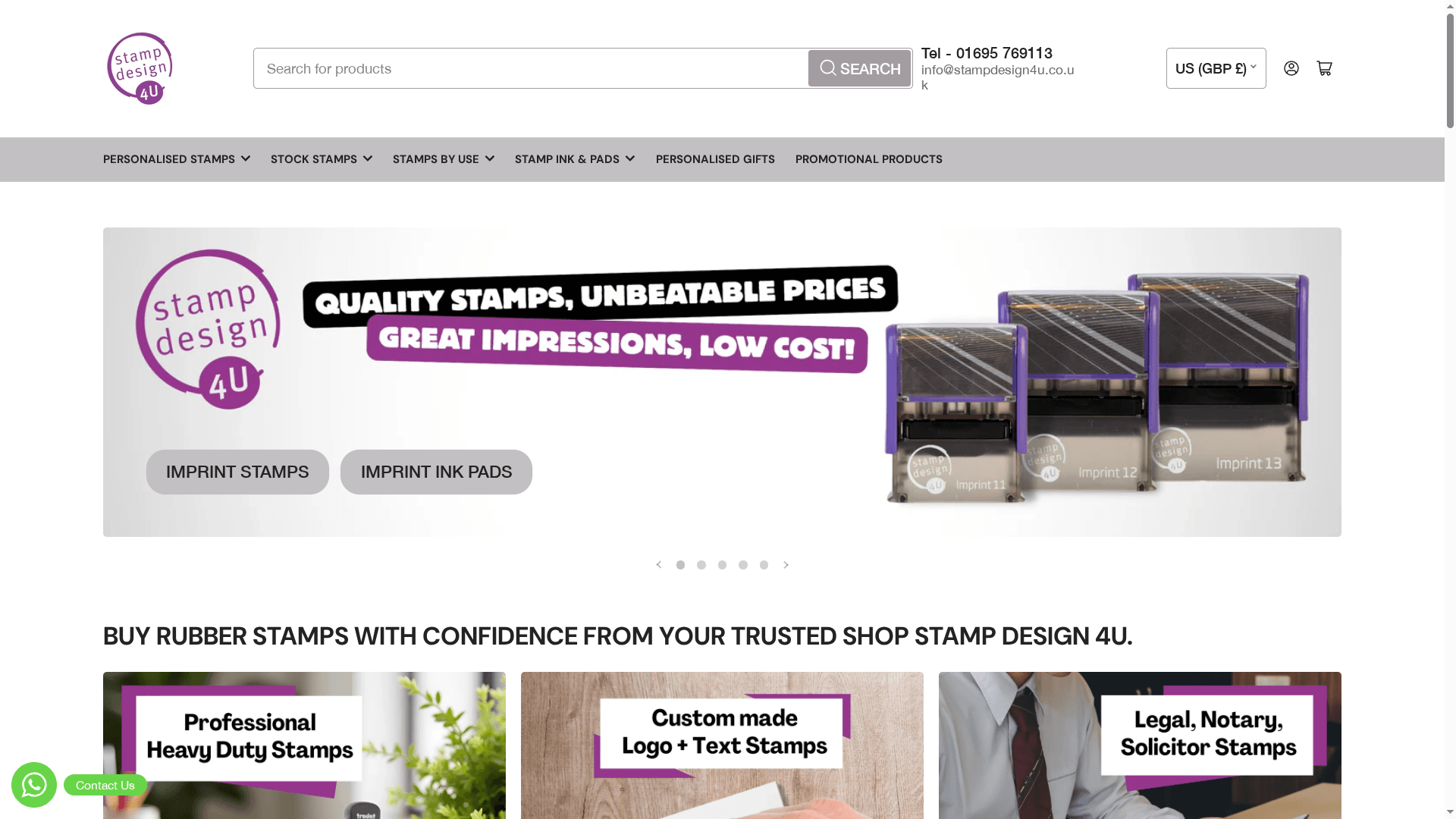
Stampdesign4u.co.uk provides a straightforward platform for designing and ordering custom rubber stamps, with support available to guide you through file requirements and design decisions. Whether you need a simple address stamp, a full logo stamp for packaging, or a promotional stamp for a marketing campaign, the product range covers a wide variety of business needs. Working with a supplier who understands the technical requirements of stamp production means fewer errors, fewer reprints, and a final product that genuinely reflects your brand. Explore the available options and take the next step toward a consistent, professional stamp solution.
Frequently asked questions
What file type is best for a workplace stamp design?
Vector formats such as AI, EPS, or SVG are ideal for stamp production because they scale without distortion and produce clean, consistent edges regardless of output size.
How can I prevent my stamp design from becoming blurry or illegible?
Avoid fine details and thin fonts, and leave adequate spacing between all elements. Excess fine detail and thin strokes are among the most common causes of degraded or shifted designs during stamp production.
What is ‘breathing room’ in stamp design?
‘Breathing room’ refers to the clear space left around each design element. Sufficient space around elements prevents ink bleed in tight areas, which keeps the impression legible and clean.
Do I need to outline fonts before submitting a stamp design file?
Yes. Converting text to outlines before submission ensures accurate reproduction and prevents font substitution if the file is opened on a machine without the original typeface installed.
Recommended
- Custom Logo Branded Rubber Stamps – Stamp Design 4U
- Boost Your Branding: Custom Logo Stamps For Businesses – Stamp Design 4U
- Custom Stamp Design Workflow for Perfect Personalisation – Stamp Design 4U
- Business Stamp Layout Guide for Effective Branding UK – Stamp Design 4U
- Custom Sign Workflow for Businesses: A Step-by-Step Guide -
- DTF Printing for Business Branding: How Custom DTF Transfers Boost Sma – Transfer Kingz