

At Stampdesign4u, a first day cover means a postage-style personalised rubber stamp, designed to look like a postmark or postal frank, used for addressing, branding and commemorative mailings. It is not a philatelic collectable but a working stamp you order, ink and press yourself. These stamps are available in several formats and are commonly used by small businesses for return addresses, packaging, and one-off promotional mailshots.
TL;DR:
- Self-inking stamps are best for high-volume use, lasting around 10,000 impressions before refilling, while pre-inked stamps handle finer detail and up to 50,000 impressions.
- Designs with greyscale shading or soft shadows will not engrave well; only pure black and white artwork ensures clean impressions, especially with fine lines.
- Ordering accurately requires finalizing dimensions, supplying vector files, and checking proofs thoroughly to avoid costly mistakes and delays.
- Ink choice must match the surface: dye-based inks work on paper, fabric inks are needed for textiles, and pigment inks are essential for non-porous surfaces to prevent smearing.
- Regular cleaning and proper storage extend stamp life and impression quality, particularly when switching between different ink types or materials.
Table of Contents
- When would you use a postage-style stamp?
- Which stamp types work best for postage-style impressions?
- Design requirements and the pitfalls that ruin a stamp
- How to order: checklist and what to expect
- Keeping ink and impressions consistent across surfaces
- A note from Steven at Stamp Design 4U
- Shop postage-style stamps built for the job
- Further reading and where to shop
When would you use a postage-style stamp?
A postage-style stamp earns its place on a workbench because it does several jobs a printed sticker cannot. It works for anyone who needs a repeatable, professional mark without reordering printed stock every time stock runs low.
Typical situations include:
- Branding packaging and mailers for small retailers and makers who want a consistent, handmade look on every parcel.
- Return address stamping for mass mailings, wedding invitations or Christmas cards, where hand-addressing hundreds of envelopes would take hours.
- Commemorative or event stationery, marking a shop anniversary, product launch or seasonal promotion with a postmark-style design.
- Promotional mailshots, where a stamped flourish adds a tactile, personal touch that a laser-printed label simply cannot fake.
Compared with pre-printed labels or stickers, a stamp gives you flexibility. Change the ink colour, press it on different paper stocks, or use it for years without reordering. The slight variation between impressions, something a digital print never has, is often exactly the charm customers respond to.
Which stamp types work best for postage-style impressions?
The stamp type you choose depends on volume, detail and the surface you’re stamping. Getting this wrong is the single most common reason someone orders a stamp and finds the results disappointing.
- Self-inking stamps suit high-volume, repeat use. The ink pad sits inside the mechanism, so you get consistent impressions without a separate pad, and they’re rated for roughly 10,000 impressions before a refill is needed, according to Stampty’s guide to custom rubber stamps.
- Pre-inked stamps trade some speed for detail. They use a porous die that holds ink internally, capturing finer lines and small text more cleanly, and can last up to around 50,000 impressions, per the same Stampty comparison.
- Traditional rubber mounts give you the widest choice of ink colours and specialty formulas, useful when a business wants an exact brand colour match rather than the standard black or blue.
- Photopolymer and metal-head options suit craft applications, including wax sealing or textured card, where a harder or more precise die holds up better than standard rubber.
If you’re addressing hundreds of envelopes, a self-inking stamp saves your wrist. If your design has fine serif text or a detailed logo, pre-inked usually wins.
Design requirements and the pitfalls that ruin a stamp
Rubber is a binary medium. There is ink, or there is no ink, with nothing in between, so any artwork with greyscale shading, soft shadows or gradients will not translate. Design guides are consistent on this point: pure black and white artwork is the only format that engraves reliably.

Statistic callout: Low-resolution files and overly thin line weights are cited as the two most common causes of blurred or broken impressions in practical stamp-making guides, well ahead of ink or pressure problems.
Follow this sequence before you submit artwork:
- Design at actual stamp size. Working full scale, rather than scaling down a large logo, is the surest way to catch text that will disappear once engraved, a point backed by Stampty’s design guidance.
- Check your minimum font size. Small font sizes at final stamp size risk filling in or breaking up during engraving.
- Watch your line weights. Extremely fine line weights tend to drop out; keep outlines slightly thicker than they look on screen.
- Mind your negative space. Reverse (white-on-black) text needs generous spacing between letters, or the white gaps clog with ink and vanish.
- Submit the right file format. Vector formats such as SVG or a properly embedded PDF are preferred; raster files should only be a fallback, supplied at final size and high resolution.
- Print a test proof at scale and hold it against the surface you’ll actually stamp, checking legibility before you commit to an order.
Pro Tip: Simplifying a logo down to its core shape and lettering, dropping fine decorative flourishes, almost always improves legibility at stamp size, even when it feels like you’re losing detail.
How to order: checklist and what to expect
Ordering a postage-style stamp is straightforward once you know the sequence. Rushing the artwork stage is the usual reason a proof gets bounced back and forth.
- Choose your stamp type based on volume and detail, following the comparisons above.
- Set final dimensions before you touch artwork, since resizing after the fact often breaks fine text.
- Supply the correct file, ideally vector, with any embedded fonts flattened to outlines.
- Flag if you need a mirror or reverse image, particularly for wax seals or anything read through glass.
- Approve the proof carefully; this is your last chance to catch a spacing or sizing issue.
- Confirm quantity and finish so production doesn’t stall on a missing detail.
Turnaround varies by supplier workload and stamp complexity, so treat any timescale as an estimate rather than a guarantee. Following a structured order checklist shortens the back-and-forth considerably, particularly for bulk orders or custom sizes, where getting in touch with support before you submit artwork can save a redo.
Keeping ink and impressions consistent across surfaces
The ink you choose has to match the surface you’re stamping, or you’ll get smearing, poor absorption, or impressions that fade within days. Paper and card generally take standard dye-based inks well, while kraft and other absorbent stocks often need a slightly thicker ink to stop bleed. Fabric requires a dedicated fabric ink that cures rather than simply drying on the surface, and non-porous materials such as plastic or glass need a pigment ink designed to sit on top rather than soak in.
Pad type and ink viscosity both affect how much detail survives. A thinner, faster-drying ink suits fine text; a heavier ink suits bold logos but can clog small gaps.
- Clean the die regularly with a soft, damp cloth to stop dried ink building up in fine lines.
- Refill pads before they run dry rather than after, since a starved pad drags ink unevenly.
- Store stamps away from heat and direct sunlight, which dries out both pad and rubber over time.
Pro Tip: If you switch between paper and fabric jobs often, keep a second stamp dedicated to fabric ink; mixing ink types on one die shortens its life and dulls the impression, according to Stamp Design 4U’s own care guidance.
A note from Steven at Stamp Design 4U
Every week, someone sends us artwork that looks perfect on a screen and would fail the moment it hit rubber. That gap between “looks fine” and “engraves fine” is where most of my time goes. My team reviews every proof before it goes to production, and we’ll flag a sizing or contrast issue rather than let it slide through. If you’re unsure how your design will hold up, get in touch before you order. It’s easier to fix on screen than after the stamp arrives.
— Steven
Shop postage-style stamps built for the job
This service provides a proofing step most sticker printers skip entirely, so mistakes get caught on screen, not after your stamp arrives. If you’re addressing envelopes or invitations at volume, the Trodat 4927 9 Line Logo and Text Rubber Stamp handles dense text well and suits a return-address or logo layout.
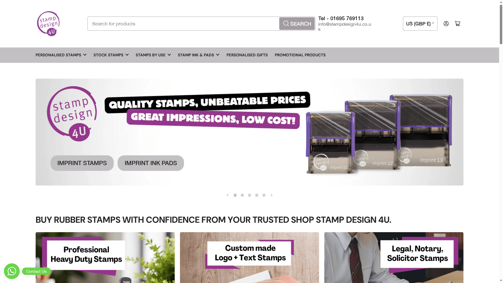
For packaging and mailers, browse the Personalised Packaging Stamps collection, built specifically for postage-style impressions on parcels and mailshots. If you just need a compact address stamp, the Imprint 13 58 x 22mm 5 Line Address Stamp fits standard envelopes cleanly, and for repeat-customer promotions, the Loyalty Stamps range covers incentive cards and reward schemes. Send us your artwork and we’ll check it against the design rules above before anything goes to production.
Further reading and where to shop
For more detail on specific stages of the process, these guides go deeper than this article’s scope allows:
- 7 useful examples of custom stamps for every need
- How to care for custom stamps: a practical guide
- What is a commemorative stamp design: a UK guide
If none of these match what you’re after, the full Stamp Design 4U shop covers every stamp category on offer.