
TL;DR:
- Effective stamp layout involves deliberate arrangement of text, logos, and design elements to ensure clarity and professionalism. Proper spacing, element hierarchy, shape, and size are crucial to creating impressions that reinforce brand identity or craft purpose. Thoughtful design of a stamp’s layout enhances readability, visual appeal, and the impression’s overall impact on viewers.
Most people assume that designing a custom rubber stamp is straightforward: pick your text, add a logo, and place your order. In practice, the arrangement of those elements — the stamp layout — determines whether your stamp looks professional or cluttered, legible or confusing. For small businesses relying on stamps for branding, and for creatives using them on craft projects or stationery, layout is the difference between a stamp that works and one that wastes your money. This guide covers everything you need to know to get it right.
Table of Contents
- What is stamp layout?
- Key elements of stamp layout
- Choosing the right stamp layout for your needs
- Common mistakes and expert tips for stamp layout
- Why stamp layout matters more than you think
- Bring your ideal stamp layout to life
- Frequently asked questions
Key Takeaways
| Point | Details |
|---|---|
| Stamp layout defined | Stamp layout is the arrangement of all design elements, balancing legibility and visual impact. |
| Key design elements | Fonts, logos, spacing, and shape each play a crucial role in professional and creative stamp outcomes. |
| Customisation value | Matching layout to your project or brand goal leads to more effective and memorable impressions. |
| Avoid common errors | Steer clear of overcrowding and unclear designs by prioritising white space and clarity. |
What is stamp layout?
Stamp layout refers to the deliberate arrangement of all visual and textual elements on the surface of a stamp. This includes the position of your business name, logo, address, tagline, decorative borders, and any other design detail that will appear in the final impression. It is not simply a matter of filling available space; it is a considered design discipline that affects how clearly and accurately information is communicated.
A well-structured layout directly supports brand recognition. When your stamp impression is consistent, well-spaced, and easy to read, it reinforces the same visual identity that appears on your business cards, letterheads, and packaging. A poor layout, by contrast, creates impressions that are muddy, misaligned, or simply hard to decipher.
According to a business stamp layout guide, the core purpose of layout planning is to ensure every element serves a function rather than competing for attention.
Key considerations within stamp layout include:
- Element hierarchy: Which information should the eye see first?
- Proportional spacing: How much blank area exists between design components?
- Boundary management: Are all elements comfortably within the stamp’s usable surface?
- Consistency: Does the layout reflect the visual style used elsewhere in your branding?
- Purpose alignment: Does the layout suit the specific use case, whether business documentation, loyalty cards, or craft projects?
The distinction between personal and business stamp needs is also worth noting. A craft enthusiast making wedding favour packaging may prioritise decorative elements and fluid shapes, while a company stamping invoices needs a layout that prioritises address details and logo placement above all else.
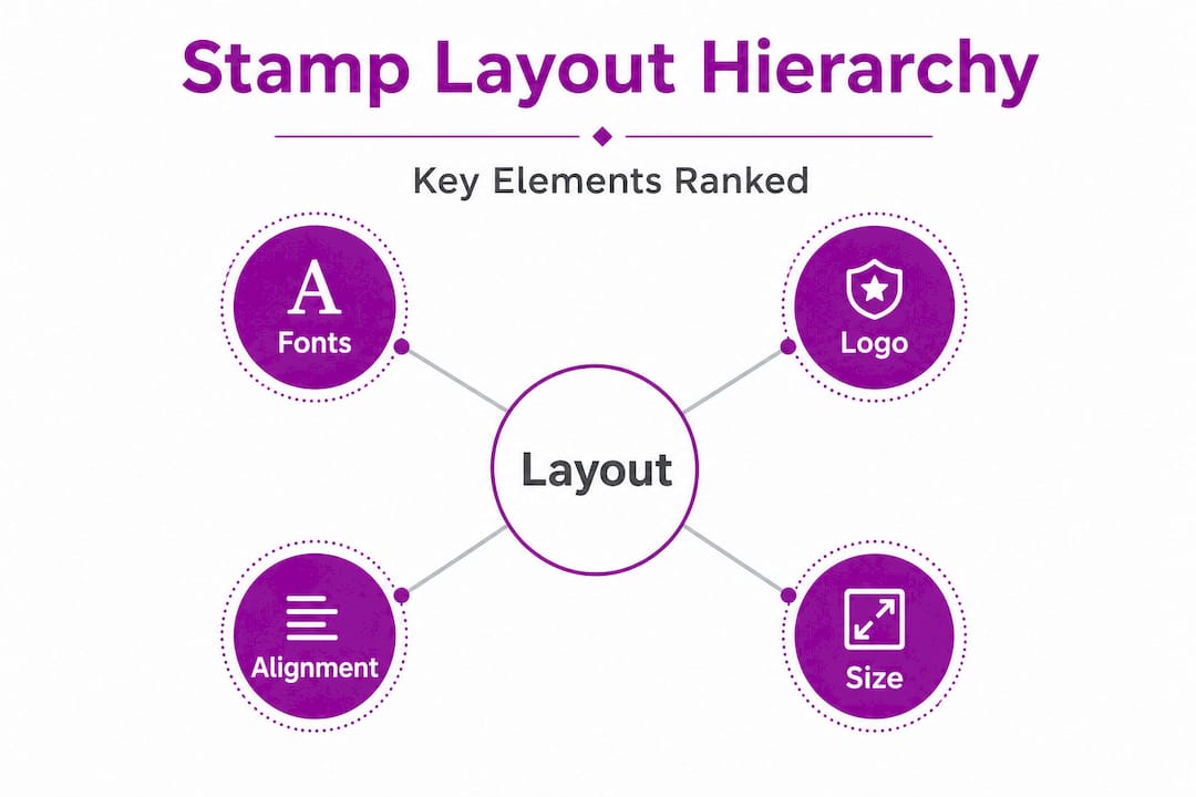
Key elements of stamp layout
Once you understand what stamp layout means, the next step is breaking it down into its individual components. Each element carries weight in the overall impression, both literally and figuratively.
Fonts and typefaces
The typeface you choose communicates personality before the reader processes the words. Serif fonts, such as Times New Roman, lend a traditional, authoritative tone suited to legal practices or established retailers. Sans-serif fonts, such as Arial or Helvetica, convey a clean, modern feel that suits contemporary brands. Script fonts can add charm to creative or personal projects, but they reduce legibility significantly at small stamp sizes.
Font size is equally important. At sizes below 6 points, most fonts will lose definition in the stamp impression. For business stamps, 8 to 12 points is a reliable range for body text, with the business name set larger to create clear hierarchy.
Logo placement
The position of your logo within the stamp layout signals its importance. Placing a logo centrally makes it the dominant element, which works well for brand stamps on packaging. Positioning it to the left with text to the right creates a more balanced, letterhead-style appearance. Logos that are too large relative to the stamp dimensions can bleed at the edges when ink is applied, so maintaining a margin of at least 1.5 to 2mm around the design boundary is standard practice. Refer to a custom stamp design workflow for specific guidance on preparing logo files for stamp production.
Text alignment and spacing
Alignment choices — left, right, centre, or justified — affect the rhythm of a stamp impression. Centre-aligned text suits circular or square stamps where a symmetrical design looks natural. Left-aligned text works better on rectangular stamps that carry multiple lines of structured information, such as a name, address, and telephone number.
Spacing between lines (leading) and between letters (tracking) should be generous enough to prevent ink from filling in the gaps between characters, particularly on self-inking stamps where ink delivery is consistent and heavier. Following best practices for custom stamps when setting tracking and leading will help you avoid impressions that appear as solid blocks of ink rather than legible text.
Shape and size
| Stamp shape | Best suited for | Typical use case |
|---|---|---|
| Rectangular | Multiple lines of text or logo with text | Business address, invoice stamping |
| Square | Balanced logo and short text | Brand stamps, packaging marks |
| Circular | Logos, seals, monograms | Official documents, craft projects |
| Oval | Decorative text or loyalty marks | Retail loyalty schemes, stationery |
Numbered steps for approaching the layout at the sizing stage:
- Confirm the stamp’s physical dimensions in millimetres before beginning the design.
- Map out element positions on grid paper or a digital template at exact scale.
- Assign the largest space to your primary element (logo or name).
- Add secondary elements (address, tagline) with sufficient spacing between each line.
- Leave a minimum 2mm border around the entire design to avoid clipping at the stamp edge.
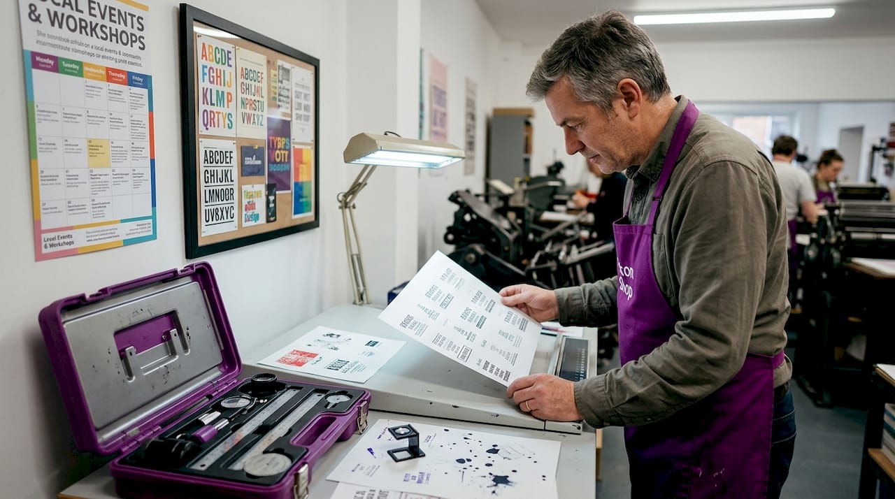
Pro Tip: Always request a digital proof at actual size before approving your order. Viewing a design at 300% on screen bears no relation to how a 40mm wide stamp impression will actually look on paper.
Choosing the right stamp layout for your needs
With a solid understanding of the elements involved, the next task is matching a layout type to your actual requirements. The wrong layout for the job is just as problematic as a poorly designed one.
Assessing stamp purpose
The intended function of your stamp drives every layout decision. Consider the following common use cases:
- Business branding stamps: These need the company name, logo, and optionally an address or website. A logo-centric layout with supporting text beneath works well.
- Loyalty card stamps: Compact and simple, these require minimal text and a clear impression mark. Browse loyalty stamp options for size and format references.
- Administrative stamps: Words such as “Received,” “Approved,” or “Confidential” with a date box. Text-heavy layouts are appropriate here.
- Creative and craft stamps: Decorative borders, illustrated motifs, or personal monograms. Artistic layouts with more visual freedom work best.
- Event and promotional stamps: Short messages, website URLs, or campaign slogans. Balanced layouts that are readable at a glance serve this purpose well.
Comparing layout types
| Layout type | Primary element | Secondary element | Best for |
|---|---|---|---|
| Logo-centric | Full-width logo | Small text below | Brand packaging, retail |
| Text-heavy | Multi-line text | No logo | Administrative, address stamps |
| Balanced (logo and text) | Medium logo | Equal text proportion | General business branding |
| Decorative | Illustrated border or motif | Short text or monogram | Craft, events, personal use |
Looking at logo stamp examples gives a practical view of how different layouts perform across industries and contexts. For a broader view across purposes, custom stamp examples illustrates how layout choices shift depending on whether the stamp is for business, charity, or personal use.
Questions worth asking before committing to a layout:
- Will this stamp be used on standard white paper, coloured card stock, or textured surfaces?
- How frequently will it be used, and does that affect ink volume and stamp mechanism choice?
- Is the stamp a standalone brand tool, or does it need to complement other printed stationery?
- Will the impression need to fit within a defined area on a document, such as a signature box or loyalty card grid?
Pro Tip: If you are unsure between two layout formats, order a single test stamp before committing to bulk production. A small investment upfront saves significant cost and time if the impression does not read as expected in real-world conditions.
Common mistakes and expert tips for stamp layout
Even experienced designers and business owners make predictable errors when approaching stamp layout for the first time. Knowing what to avoid is just as useful as knowing what to do.
Mistakes to avoid
- Overcrowding the design: Attempting to fit a full business address, logo, tagline, telephone number, and website onto a 38mm x 14mm stamp is a frequent error. The resulting impression is unreadable and unprofessional.
- Ignoring font weight at small sizes: Bold fonts at 7 points or below will often fill in and merge, creating a solid smear rather than readable text. Use regular or light weight fonts for small sizes.
- Failing to account for ink spread: Ink expands slightly upon contact with paper. Designs with very fine lines or tight letter spacing will lose definition in the impression.
- Choosing shape for aesthetics over function: A circular stamp looks appealing but is often inefficient for text-heavy information, since the curved boundary wastes usable space at the top and bottom.
- Skipping a test print: Reviewing artwork on screen at an enlarged scale is not equivalent to seeing a physical impression. Always test before approving.
Expert tips for better results
- Maintain generous white space. Empty space is not wasted space; it helps the eye navigate to the important elements quickly.
- Limit the number of fonts to two at most: one for the primary name or logo text, one for supporting detail.
- Align all elements to a central axis on symmetrical stamps, or a consistent left or right margin on rectangular designs.
- For workplace stamp design, standardise the layout across all stamp types used within the business to create visual coherence across documents.
- Draw layout inspiration from printed design formats that work at small scales, such as thank you note layouts or packaging labels.
- For creative projects, explore stamp imprint ideas that show how minimal layouts can produce striking, artistic results.
“The best stamp designs are the ones where nothing can be removed. Every element earns its place, and the impression reads immediately at a glance.”
This principle mirrors the broader graphic design maxim that simplicity is not a lack of content; it is the removal of everything unnecessary.
Why stamp layout matters more than you think
Here is an observation worth sitting with: most people commissioning a custom stamp spend the majority of their time deciding what to put on it, and almost no time thinking about how it is arranged. The content gets careful thought. The layout gets whatever defaults the design template offers.
This is a missed opportunity. A stamp is often the first physical interaction a customer has with a brand. When a parcel arrives with a clean, well-proportioned stamp impression on the packaging tape, it registers — even unconsciously — as an indicator of quality. When a stamp impression is cramped, misaligned, or difficult to read, it undermines the credibility of the business it represents, regardless of how good the product inside the parcel actually is.
Small layout changes produce outsized results. Moving a logo from the top of a rectangular stamp to the left side and placing the business name in a larger font to its right can transform the impression from busy to authoritative. Increasing the leading between lines of an address stamp by just one point can make the difference between legible and illegible when stamping on slightly rough paper stock.
The logo stamp creation guide makes a useful point about treating a stamp as a miniature piece of brand communication rather than a functional tool. Once you approach layout with that mindset, the decisions become clearer and the results become more consistent.
For creatives, the same logic applies. A handmade card stamped with a thoughtfully arranged monogram or decorative motif carries more visual weight than one with a hasty, overcrowded impression. Layout communicates care and intention. In a product market full of digital noise, a well-executed physical stamp impression is a surprisingly effective differentiator.
Bring your ideal stamp layout to life
Applying these layout principles to a real product is the next logical step. Whether you need a robust business branding tool or a compact creative stamp, the right format and size will determine how well your layout performs in practice.
For business owners looking to combine logo and multi-line text in one clean impression, the large custom logo stamp at 60 x 40mm offers the space needed to execute a balanced layout without crowding. For retail and hospitality businesses running loyalty programmes, the compact loyalty stamp delivers a clean, repeatable impression perfectly suited to card-sized grids. Both options are available to customise directly through Stamp Design 4U, with design support to help you get the layout right before production.
Frequently asked questions
How do I decide what to include on my stamp layout?
Choose elements based on your stamp’s purpose: a business branding stamp typically needs a name, logo, and contact detail, while a loyalty stamp needs only a simple mark. Purpose-driven guidance helps narrow down which elements earn their place on the stamp surface.
What stamp size is most effective for business branding?
Rectangular stamps around 60 x 40mm provide sufficient surface area for both a logo and supporting text, making them the most commonly used format for business branding purposes.
Can I create a custom stamp layout for personal or craft use?
Yes, custom layouts can be designed for weddings, invitations, or craft projects in any theme or style. Creative stamp imprint examples show just how versatile a personalised layout can be beyond standard business use.
How do I avoid my stamp layout looking crowded?
Retain generous blank space around all elements, restrict the number of design components to only what is essential, and always test the design at actual stamp size before ordering. Workplace stamp design guidance provides practical advice on keeping layouts clean and functional.
Recommended
- Business Stamp Layout Guide for Effective Branding UK – Stamp Design 4U
- Streamline your workplace stamp design for branding success – Stamp Design 4U
- Custom Stamp Design Workflow for Perfect Personalisation – Stamp Design 4U
- Business branding with stamps: Practical steps for small businesses – Stamp Design 4U