
TL;DR:
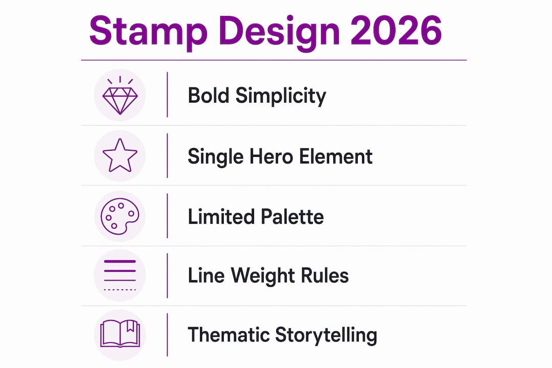
- Stamp design trends in 2026 emphasize bold simplicity, featuring single hero elements, limited color palettes, and strong typography for quick recognition. These principles guide both official postal releases and small business branding, promoting clarity and consistency across various applications. Effective designs prioritize production constraints, such as line weight and simplicity, to ensure legibility and impactful storytelling at stamp size.
Stamp design trends 2026 are defined by one clear principle: bold simplicity that works at a glance. Whether you are a design enthusiast tracking postal releases or a small business owner using custom rubber stamps for packaging and stationery, the direction is the same. Clean lines, strong typography, and instant recognition have replaced ornate detail. The USPS, Finnish Posti, and independent stamp designers are all moving towards formats that communicate clearly at small scale. This shift matters for anyone creating or ordering stamps in 2026.
What are the main stamp design trends 2026?
The dominant visual direction in 2026 stamp design is simplified, bold imagery built around instant recognition. The USPS has made this explicit across multiple 2026 releases, using simplified portraits, bold typography, and single-colour backgrounds. That approach is not accidental. Stamps must read clearly from arm’s length, under poor lighting, and at a size smaller than a matchbox.
Official postage releases setting the tone
Several 2026 releases illustrate these trends directly:
- USPS ‘American Icons’ collection: Released 9 June 2026 and curated by Ralph Lauren, this 13-stamp set uses cohesive thematic design with simplified, iconic imagery. Each stamp centres on a single recognisable subject. The set demonstrates how a themed pane can tell a broader cultural story without cluttering individual designs.
- USPS Postcrossing stamps: Issued 26 May 2026, these stamps use a distinctive triangular format to stand apart visually. The format itself becomes part of the message, celebrating global letter writing and cultural exchange.
- USPS International Peace stamp: Issued 27 May 2026, this stamp features an origami crane rendered with careful art direction. Simple iconography like an origami crane requires expert handling to maintain readability and emotional impact at stamp scale.
- Finnish Posti 2026 releases: Posti’s May 2026 issues include prize-winning Europe-wide designs, Pride stamps with rainbow colours, and floral arrangements shaped like birds. These show the range of symbolic and thematic approaches active in current postal design.
The common thread across all of these is restraint. Each design commits to a single hero element or a tightly controlled colour palette. Complexity is edited out, not added in.
Pro Tip: Study official postal releases like the USPS ‘American Icons’ set before briefing a stamp designer. They demonstrate how to balance visual interest with legibility at small scale.
How do 2026 trends influence small business stamp branding?
Custom rubber stamps are a cost-effective branding tool for small businesses, capable of producing thousands of consistent impressions across packaging, stationery, and promotional materials. The 2026 design direction from postal authorities translates directly into practical guidance for business owners. Bold, clean, and simple is not just an aesthetic preference. It is what works when ink meets paper at small scale.
Here are the key ways 2026 trends apply to small business stamp use:
- Adopt a single-element logo for stamp use. A logo with one clear focal point reproduces far better than a complex multi-element design. Think of the USPS approach: one subject, clear background, strong contrast.
- Commit to two colours maximum. Stamps with more than two ink colours require multiple passes or separate stamps. Two colours keep production simple and impressions consistent.
- Use your brand typeface, not decorative fonts. Bold, legible typefaces transfer cleanly. Thin script fonts lose definition quickly, especially on textured surfaces like kraft paper or cardboard.
- Apply stamps consistently across touchpoints. Using stamps consistently across packaging, thank-you cards, tissue paper, and envelopes builds recognition over time. A stamp used once on a parcel does little. A stamp used on every customer interaction becomes a brand signal.
- Consider sustainability. A rubber stamp replaces hundreds of printed labels. For small businesses with eco-conscious customers, this is a genuine selling point worth communicating.
The practical uses of custom logo stamps extend well beyond packaging. Stamps appear on price tags, fabric bags, wax seal backings, and event materials. Each application reinforces the brand without additional print costs.
Pro Tip: Order a test impression on your actual packaging material before committing to a full run. Ink behaves differently on coated card versus uncoated kraft paper.
![]()
What are the design constraints for effective rubber stamps?
Production constraints must come before stylistic choices when designing a rubber stamp. This is the rule that separates stamps that work from stamps that disappoint. Ink spreads slightly on contact with paper. Fine details fill in. Thin lines disappear. Gradients become muddy blobs. Addressing these realities first protects your design investment.
Line weight and simplification
Simplified artwork with thicker lines is the foundation of any effective rubber stamp design. The minimum safe line weight for rubber stamp production is generally 1.5–2pt at final size. Below that, lines merge or vanish after a few hundred impressions. Gradients and photographic detail are not transferable to rubber stamp format at all.
Key constraints to observe:
- Avoid thin serifs and hairline strokes. Sans-serif typefaces like Helvetica, Futura, or Gill Sans reproduce far more reliably than fine serif faces.
- Remove gradients entirely. Flat, solid fills are the only reliable approach for rubber stamp artwork.
- Check digital proofs at actual stamp size. A design that looks detailed at A4 scale often becomes illegible at 40 x 60mm. Always proof at 1:1.
- Balance vintage and modern styles with production reality. Vintage-style stamps with crosshatching and fine engraving lines are popular in 2026, but these details require careful simplification before production.
Style comparison: postage stamp vs. custom business stamp
| Design Element | Postage Stamp Approach | Custom Business Stamp |
|---|---|---|
| Colour | Single or limited palette | One to two ink colours |
| Typography | Bold, minimal text | Brand typeface, bold weight |
| Imagery | Single hero element | Logo mark or simple icon |
| Detail level | Professionally simplified | Simplified for ink transfer |
| Format | Fixed size, regulated | Flexible, chosen by client |
Designers prioritise bold essential shapes and safe line thickness to protect legibility once artwork is produced as a rubber stamp. The postage stamp world has refined this discipline over decades. Business stamp designers benefit from applying the same rigour.
Pro Tip: Convert your logo to a single flat colour and view it at actual stamp size before sending artwork to a supplier. If it reads clearly in that format, it will work as a stamp.
How do thematic and symbolic elements add storytelling to stamp design?
Stamps function as compact units of visual storytelling. The USPS treats every stamp as something that must work from arm’s length and up close. That dual requirement pushes designers towards symbols with strong cultural resonance, because a single well-chosen image carries more meaning than a paragraph of text.
The 2026 releases demonstrate this clearly:
- Origami cranes on the International Peace stamp carry associations with Japanese culture, peace movements, and patience. One image, multiple layers of meaning.
- Rainbow colour progressions on Finnish Posti’s Pride stamps communicate inclusion and celebration without a single word of text.
- Triangular stamp formats on the USPS Postcrossing series signal difference and curiosity before the design is even examined closely.
- Floral arrangements shaped like birds, as seen in Posti’s spring 2026 releases, show how natural forms can carry dual meanings within a single composition.
For small businesses and collectors, these approaches offer direct inspiration. A bakery stamp might use a single wheat sheaf. A bookshop might use a simplified open book. A florist might use one bold bloom. The principle is the same: choose one symbol that carries your brand’s core meaning, then simplify it until it reads instantly.
Designing stamps for collectors follows the same logic. Collectors respond to stamps with clear thematic identity and strong visual coherence. A set of stamps with a unified symbolic language holds more appeal than a collection of unrelated designs.
Key takeaways
The most effective stamp designs in 2026 commit to a single bold element, a limited colour palette, and line weights that survive ink transfer.
| Point | Details |
|---|---|
| Bold simplicity dominates | USPS and Posti 2026 releases all prioritise single hero elements and clean palettes. |
| Production constraints come first | Design for ink transfer before style; minimum 1.5–2pt line weight at final size. |
| Consistency builds brand recognition | Apply custom stamps across all packaging and stationery touchpoints for maximum impact. |
| Symbols carry more than text | One well-chosen image communicates faster and more memorably than descriptive copy. |
| Proof at actual stamp size | Always check artwork at 1:1 scale before ordering to catch detail loss early. |
Why simplicity is the hardest part of stamp design
Most clients I work with arrive with a logo that is too complex for stamp use. It is not a criticism of the logo itself. It is simply that logos are often designed for screens and large-format print, where fine detail is an asset. At 40 x 60mm in ink on paper, that same detail becomes a liability.
The 2026 postal releases from USPS and Finnish Posti are instructive precisely because they show what professional art direction looks like under genuine constraints. The Ralph Lauren-curated ‘American Icons’ set is not simple because simplicity was the easy option. It is simple because the designers understood that clarity at small scale requires discipline, not decoration.
The mistake I see most often with business stamp orders is treating the stamp as a miniature version of an existing design. The better approach is to treat it as a separate design problem entirely. What is the one element of your brand that must survive reduction to a 40mm impression? Start there, and build outwards only as far as legibility allows.
Consistency is the other factor that most businesses underestimate. A stamp used on one type of packaging and nowhere else has limited impact. The same stamp applied to envelopes, tissue paper, price tags, and thank-you cards becomes a recognisable brand signal within weeks. That repetition is where the real value of business branding with stamps lies.
— Steven
Create your own stamp aligned with 2026 design trends
Stampdesign4u offers a straightforward way to put these principles into practice. The Trodat 4927 9 Line Logo and Text Rubber Stamp at 60 x 40mm is well suited to the bold, clean formats that define current design direction. It handles logo marks and text together, making it practical for business branding across packaging and stationery.
Stampdesign4u supports customers from initial design through to finished product, with options covering everything from simple text stamps to full logo reproductions. The platform serves businesses and collectors across the UK and internationally. If you want to apply the 2026 design principles covered in this article to a real product, Stampdesign4u is a practical starting point.
FAQ
What defines stamp design trends in 2026?
The defining characteristic of stamp design trends 2026 is bold simplicity. USPS and international postal services are prioritising single hero elements, limited colour palettes, and strong typography for instant recognition.
Are triangular stamps a recognised format in 2026?
Yes. The USPS issued triangular Postcrossing stamps on 26 May 2026, using the format to signal visual distinction and celebrate global letter writing. Unusual formats are an active trend in current postal design.
What line weight should i use for a custom rubber stamp?
A minimum line weight of 1.5–2pt at final stamp size is the standard production guideline. Lines thinner than this fill in or disappear after repeated use due to ink spread.
How do small businesses benefit most from custom stamps in 2026?
Custom rubber stamps deliver the most value when applied consistently across multiple touchpoints, including packaging, envelopes, and stationery. Mixing fonts and colours across different materials weakens brand recognition.
Can postage stamp design trends inspire business stamp ideas?
Directly. The USPS ‘American Icons’ set and Finnish Posti’s 2026 releases both demonstrate how a single well-chosen symbol, simplified for small-scale reproduction, communicates brand identity clearly and memorably.