

TL;DR:
- Accurate stamping enhances brand trust, process control, and compliance through clear and legible impressions.
- Designing with simple, black-and-white artwork and testing on actual substrates ensures consistent results.
Accurate stamping protects brand presentation, maintains operational legibility, and reduces legal or traceability risk. Three reasons underpin this: a clear impression builds customer trust, a readable mark keeps internal processes reliable, and a traceable stamp supports documentation that banks, trade partners, and regulators may scrutinise. The sections below cover design rules, material choices, proofing steps, and operator technique so you can secure that accuracy from the first impression onwards.
- Brand trust: a muddy or incomplete mark signals carelessness before a word is read.
- Process control: stamps appear on goods-received notes, QA records, and dispatch labels where legibility is functional, not decorative.
- Documentation reliability: unclear marks create disputes, failed audits, and rejected paperwork.
Table of Contents
- Why stamping accuracy matters for branding, operations and compliance
- What causes muddy or inconsistent stamp impressions?
- Design rules that ensure a clear, repeatable stamp impression
- Which stamp type delivers the best accuracy for your use case?
- How ink and substrate choice change your stamping results
- Simple QC steps to guarantee accurate impressions at scale
- Operator technique for consistent, repeatable impressions
- UK-specific situations where inaccurate stamping causes problems
- Regulatory compliance and legal liability risks from inaccurate stamping
- What happens when stamping goes wrong: real-world examples
- How technology is improving stamping accuracy
- Stampdesign4u helps UK buyers get accurate impressions from the first order
- Key takeaways
- The detail most buyers overlook
- Next steps and useful resources
Why stamping accuracy matters for branding, operations and compliance
A stamp impression is often the first physical mark a customer or partner sees on a parcel, invoice, or certificate. Stamp branding consistency directly influences how professional a business appears at every touchpoint. Buyers increasingly evaluate stamps for consistent impressions across workflows, rather than only for initial appearance, treating imprint clarity as a signal of process control and attention to detail.
Operationally, stamps appear on goods-received notes, QA sign-off sheets, and dispatch records. A mark that is unreadable in a photograph or photocopy creates gaps in audit trails and slows receiving workflows. The consequences compound: a supplier whose stamps cannot be read on customs paperwork faces delays; a warehouse whose QA stamps blur on kraft board may fail an external audit.
In the UK, a company stamp is rarely a legal requirement for everyday documents. Signatures generally determine legal validity. That said, banks and overseas trade partners often request a stamp as a procedural confirmation, and an unclear mark in that context carries a real administrative cost.
- Clear impressions reinforce brand identity at every customer touchpoint.
- Legible marks keep audit trails intact and reduce dispute risk.
- Stamps requested by banks or overseas partners must be unambiguous to serve their purpose.
What causes muddy or inconsistent stamp impressions?
Most stamping failures trace back to one of four areas: artwork, material, ink, or technique. Identifying which area is at fault before re-ordering saves time and money.
Common symptoms and their likely causes:
- Blurred text: ink bleed from over-saturated pad or too-absorbent substrate.
- Filled counters (closed letters like “e” or “o”): artwork detail too fine for the engraving depth, or ink viscosity too low.
- Faint corners: mounting instability causing uneven pressure across a large die.
- Uneven borders: soft rubber compound spreading under pressure, or a rocking motion during application.
- Inconsistent density: pad saturation varying between impressions, or a worn pad surface.
Quick checks before re-ordering: press the stamp on plain white copier paper first to isolate substrate variables. Check the pad is evenly saturated, not pooling at the centre. Examine the digital engraving proof for any detail finer than 1pt line weight.
Design rules that ensure a clear, repeatable stamp impression

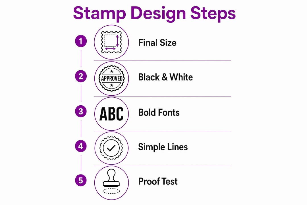
Rubber engraving is binary: the result is ink or no ink. Gradients and colour fills do not translate. Every shade of grey becomes either a solid mark or nothing, so artwork must be prepared in pure black and white before submission.
Concrete thresholds to follow:
- Minimum font size: standard positive type should be no smaller than 8pt; reverse type (white on a dark background) needs to be larger, typically 10pt or above, because the surrounding rubber is more likely to close in during engraving.
- Line weight: lines below 1pt tend to tear or disappear during engraving. Keep strokes at 1pt minimum; 1.5pt for fine decorative borders.
- Enclosed areas: small enclosed spaces (tight serifs, decorative flourishes) fill with ink. Open them up or remove them.
- File format: supply vector files (AI, EPS, or SVG) or raster files at a minimum of 600 DPI at the actual stamp size.
Design at the final stamp dimensions, not at a larger scale that gets reduced later. Reduction compresses detail below safe thresholds without warning.
Pro Tip: Print your artwork at 100% actual stamp size on plain paper and hold it at arm’s length. If you cannot read every word clearly, the engraver cannot either. Fix it before you submit.
Which stamp type delivers the best accuracy for your use case?
The right stamp format depends on volume, substrate, and the level of detail in the artwork. Each type has a different relationship with impression consistency.
- Traditional rubber with separate pad: maximum control over ink type and saturation. Best for speciality substrates (textured card, fabric) where a specific ink formulation is needed. Requires discipline to maintain even pad saturation.
- Self-inking stamps: built-in re-inking mechanism delivers consistent saturation for standard paper. Suited to high-volume office use (approvals, received, paid). Less flexible for non-standard inks.
- Pre-inked stamps: the ink is embedded in the die itself, producing the sharpest impressions for fine-detail logos. Output is consistent for thousands of impressions before re-inking. Not suited to porous or textured surfaces.
- Desk or automated units: used in high-throughput environments. Consistent pressure and alignment reduce operator variability.
Rubber compound hardness matters across all types. Soft compounds spread fine lines; hard compounds may not make full contact on textured surfaces. For fine logo work, a medium-hard compound with a stable mount gives the most repeatable result. See stamp materials guidance for compound comparisons.
How ink and substrate choice change your stamping results
The same stamp looks different on copier paper, coated stock, kraft board, and gloss labels. Ink viscosity, drying speed, and pigment concentration all interact with the surface to determine whether the impression is sharp or blurred.
- Absorbent paper (copier, uncoated): ink spreads quickly. Use a lower-viscosity ink and lighter pad saturation to prevent bleed.
- Coated or gloss stock: ink sits on the surface longer. Higher-viscosity, faster-drying formulations prevent smearing.
- Kraft board or textured card: uneven surface needs a slightly softer compound and heavier ink load to fill texture gaps.
- Gloss labels: solvent-based or pigment inks adhere better than water-based options, which bead on non-absorbent surfaces.
Testing checklist before bulk stamping:
- Stamp ten impressions on the actual substrate at normal pressure.
- Allow full drying time, then photograph under standard lighting.
- Adjust pad saturation (lighter or heavier) and repeat.
- If bleed persists, switch ink viscosity or formulation.
- Confirm the final combination with a signed-off sample before production.
Personalised packaging stamps designed for mixed substrates are worth considering if your operation uses more than one surface type.
Simple QC steps to guarantee accurate impressions at scale
A short proofing workflow catches most avoidable failures: vector artwork, then digital proof, then a physical sample impression on the real substrate. Each step filters a different class of error.
Step-by-step QC checklist:
- Review the digital proof at 100% scale. Check font sizes, line weights, and enclosed areas against the design rules above.
- Request a physical first-article impression on your actual substrate before approving production.
- Inspect the sample under good lighting: check corners, counters, and borders for completeness.
- For repeat production runs, stamp and inspect a sample from each new batch before use.
| Batch volume | Recommended sample size | Acceptable defect threshold |
|---|---|---|
| — | 10 impressions | — |
| — | — | 1 defect maximum |
| — | — | 2 defects maximum |
| — | — | 3 defects maximum |
Set your threshold based on the consequence of a bad impression. A stamp on a legal document warrants zero tolerance; a decorative packaging stamp may allow minor variation.
Operator technique for consistent, repeatable impressions
Even a well-made stamp produces variable results with poor technique. Mounting stability and pressure distribution are common causes of uneven impressions, and operator habits drive both.
- Apply even, straight-down pressure. Rocking the stamp shifts ink to one edge.
- Use a firm, stable work surface. A soft desk mat absorbs pressure unevenly.
- Re-ink at consistent intervals. Do not wait until impressions fade; set a count-based re-inking schedule.
- Wipe the die with a damp cloth after each session to prevent ink build-up in fine details.
- Store stamps face-down on a pad or in a case to prevent the rubber drying out.
Pro Tip: For repetitive placement tasks, cut a simple card jig with a window the size of your stamp. Place the jig on the document, drop the stamp through the window, and press. Placement time drops and alignment errors disappear.
Consistent stamp use in business also means controlling who has access to company stamps and logging their use, particularly for stamps used on financial or legal documents.
UK-specific situations where inaccurate stamping causes problems
In the UK, stamps are a procedural tool rather than a legal instrument. Signatures carry legal weight; stamps add presentational confirmation. That distinction matters when managing risk.
- Banks: some UK banks request a company stamp on account-opening forms or mandate letters. An unclear mark may delay processing or require resubmission.
- International trade: overseas customs authorities and trade partners, particularly outside the EU, often expect a legible company stamp on commercial invoices and certificates of origin. A muddy mark can hold a shipment.
- Internal records: HR, goods-received, and QA documents stamped for audit purposes must be legible in scanned or photocopied form.
Practical risk steps for UK businesses:
- Maintain a stamp register: record who holds each stamp and when it is used on formal documents.
- Restrict access to stamps used on financial or regulatory paperwork.
- If unsure whether a stamp is required by a specific organisation, confirm with the receiving party before submission.
Regulatory compliance and legal liability risks from inaccurate stamping
Where stamps appear on regulated documents, an illegible mark can constitute a documentation failure. In food and pharmaceutical supply chains, for example, traceability records must be legible and reproducible. A batch stamp that cannot be read in a photograph or scan may trigger a non-conformance under ISO 9001 or sector-specific audit frameworks.
Liability exposure is more direct when a stamp is used to authorise a transaction. If the mark is unclear and a dispute arises about whether authorisation was given, the burden of proof falls on the party that applied the stamp. Clear, consistent impressions are a basic form of evidence management.
What happens when stamping goes wrong: real-world examples
A common scenario in UK warehousing: a goods-received stamp applied to kraft board with a water-based ink produces a legible mark on the day, but the impression fades or smears within 48 hours. When the delivery is queried a week later, the record is unreadable. The resolution requires manual cross-referencing with digital records, adding hours of administrative work.
In export documentation, a company stamp on a certificate of origin that is too faint to photograph clearly has caused shipments to be held at customs while the exporter provides alternative proof of origin. The delay cost exceeds the value of the stamp many times over.
A simpler example: a small business using a self-inking stamp for branded packaging finds that the logo impression varies noticeably between the first and fiftieth impression of the day as the pad dries out. Customers receiving later parcels see a degraded mark. The fix is a re-inking schedule and a pad with higher ink capacity, not a new stamp.
How technology is improving stamping accuracy
Laser engraving has replaced hand-cutting for most commercial rubber stamps. The precision of a laser-engraved die holds fine lines and small type far more reliably than earlier mechanical methods, making the 1pt line-weight threshold achievable in production rather than theoretical.
Pre-inked polymer dies, produced using photopolymer plate technology, deliver even finer detail than traditional rubber. The ink is distributed through the die material itself, eliminating pad saturation as a variable.
Digital embossing and foil-stamping systems, used for premium packaging and certificates, combine a die with heat and pressure to produce raised or metallic impressions that are both precise and durable. These are not rubber stamps in the traditional sense, but the same design rules apply: binary artwork, minimum line weights, and substrate testing.
For high-volume industrial marking, laser marking systems apply permanent marks directly to surfaces without a physical die. Accuracy is determined by the laser’s resolution rather than rubber or ink variables. These systems are outside the scope of a custom rubber stamp order but represent the direction of travel for traceability-critical applications.
Stampdesign4u helps UK buyers get accurate impressions from the first order
Getting a stamp that performs consistently from day one depends on artwork preparation, material selection, and a proofing step that most buyers skip. Stampdesign4u handles all three. The ordering process includes artwork checks for line weight and font size, vector file handling, and a digital proof before production begins. For buyers stamping on non-standard substrates, the team can advise on ink and compound selection before you commit to a full order.
The result is fewer reorders and fewer surprises. Browse personalised logo stamps to find the right format for your use case, or go straight to the Trodat 4927 logo and text stamp for a proven self-inking option suited to office and light commercial use. Contact customer support with your substrate details or a sample surface if you need technical guidance before ordering.
Key takeaways
Accurate stamping requires aligned design, material, ink, and technique. A single weak link in that chain produces inconsistent impressions regardless of how good the other elements are.
| Point | Details |
|---|---|
| Design in black and white | Avoid gradients; keep fonts at 8pt minimum and line weights at 1pt or above. |
| Match stamp type to use case | Pre-inked suits fine logos; self-inking suits high-volume office use; rubber with pad suits specialist substrates. |
| Test on the actual substrate | The same stamp looks different on copier paper, coated stock, and kraft board. Always test before bulk use. |
| Proof before production | Request a physical sample impression and inspect corners, counters, and borders before approving the full run. |
| Stampdesign4u | Provides artwork checks, vector handling, and proofing to reduce reorders for UK buyers. |
The detail most buyers overlook
Most stamping problems are not stamp problems. They are artwork problems that the stamp faithfully reproduces. A logo designed for screen or print arrives with gradients, hairline strokes, and small reverse type that looks sharp at A4 size. Scaled down to a 40mm stamp die, those elements either disappear or fill in. The stamp does exactly what it was asked to do. The issue was upstream.
The second most common oversight is substrate testing. Buyers test their stamp on the nearest piece of paper and approve it. The stamp then goes into use on kraft mailers, tissue paper, or coated labels, and the impression looks nothing like the test. Ink formulation and pad saturation need to be set for the actual surface, not a proxy.
The practical fix is short: design at final size, supply a vector file, request a physical proof on your real substrate, and set a re-inking schedule before the stamp goes into daily use. That sequence eliminates the majority of complaints before they arise.
Next steps and useful resources
To prepare your order and avoid common failures, work through this checklist before submitting artwork:
- Confirm the final stamp dimensions and design at that exact size.
- Convert artwork to pure black and white; remove all gradients and colour fills.
- Check font sizes (8pt minimum for positive type) and line weights (1pt minimum).
- Supply a vector file (AI, EPS, or SVG) or a 600 DPI raster at actual stamp size.
- Identify your stamping substrate and request ink guidance if it is not standard copier paper.
- Request a digital proof and, where possible, a physical sample impression before approving production.
Further reading from Stampdesign4u: enhance your branding with custom stamps covers integration into packaging and customer touchpoints. The buying guide for logo stamps outlines product specifications for buyers comparing formats. Contact customer support with substrate samples or usage details if you are unsure which combination will work for your application.