

Yes. A creative, simple logo is genuinely a same-day job, and often a same-hour one if you follow a fixed process instead of chasing perfection. Consumers form their first impression of a logo in roughly 400 milliseconds, and consistent colour use alone can lift recognition by up to 80%, so speed and clarity beat complexity every time. Open Canva or Adobe Express, sketch three rough shapes, pick two colours, and you have a usable draft before your coffee cools.
- Right now: open Canva Logo Maker or Adobe Express Logo Maker and generate a first draft.
- Next: browse Pinterest for five reference images in your style.
- Then: if you want a physical brand asset, preview your mark through Stamp Design 4U.
Key Takeaways
A creative, simple logo can be designed, tested and exported within an hour using a fixed six-step process and one focused tool.
| Point | Details |
|---|---|
| Answer first | Yes, a simple creative logo is achievable in minutes using a six-step workflow and one main tool. |
| Simplicity aids recognition | Consistent colour can lift recognition by up to 80%, and first impressions form in around 400 milliseconds. |
| Test at small sizes | Shrink your logo to favicon size and check it in monochrome before finalising it. |
| Use AI to speed drafts | Prompt an AI tool for three concepts, then restrict shapes and colours to keep the result simple. |
| Turn it into a physical asset | Stamp Design 4U converts a finished logo file into a previewed, ready-to-order stamp for packaging and paperwork. |
Table of Contents
- Quick 6-step process to design a simple, creative logo
- Fast tools and when to use them
- Design tips that keep a logo simple yet memorable
- Using AI to speed up simple logo concepts
- Exporting, testing and integrating your new logo
- A different route to physical branding
- Sources
Quick 6-step process to design a simple, creative logo
You do not need a design degree to produce something sharp. You need a sequence, and six steps is enough.
- Define your one-line brand idea. Write a single sentence describing what you do and where the logo will live: website header, packaging, a stamp, a social avatar. This scopes every decision that follows.
- Pick a logo type and stop there. Choose one: a wordmark (just your name, styled), a monogram (initials), an abstract mark (a shape with no literal meaning), or an emblem (a badge-style icon with text inside). Mixing types is the fastest route to clutter.
- Choose two colours and one typeface. One dominant hue, one contrasting accent. Shopify’s design process recommends locking colour and type early so every concept stays consistent. Run the grayscale test immediately, if the mark falls apart in black and white, the idea is too reliant on colour.
- Generate three quick concepts. Use a template tool or an AI prompt (more on that below) to produce three rough directions fast, rather than perfecting one idea too early.
- Refine the strongest option for small sizes. Shrink it to very small size typical of a favicon. If details vanish or letters blur, simplify further. This single test kills more bad logos than any amount of feedback.
- Export a simple brand pack. You want an SVG for scaling, a PNG for quick digital use, and a black-and-white version for print or stamping.
Quick checklist before you call it done:
- Works in one colour
- Legible at favicon size
- Recognisable without the company name attached
- No more than two colours and one typeface
Pro Tip: Shrink your logo to the size of a thumbnail before you show anyone else. If you can still tell what it is, you’re done designing. If you can’t, you’ve made a poster, not a logo.
Fast tools and when to use them
Different jobs call for different tools, and choosing the wrong one wastes the very time you’re trying to save. Stamp Design 4U sits in this comparison because a logo isn’t finished branding until it works somewhere physical, on paper, packaging, or a stamped signature line, and that’s a job the other tools here simply don’t do.
| Tool | Best for | Ease of use / speed | Customisation | Price / free tier | Templates & assets | AI-assistance |
|---|---|---|---|---|---|---|
| Stamp Design 4U | Turning a finished logo into a physical stamp for packaging, receipts and paperwork | Fast once artwork is ready; guided upload and preview | Full control over stamp layout, ink colour, size | Paid, per stamp product | Stamp templates and layout previews | No |
| Canva | Fast general-purpose logo drafts and social assets | Very fast, drag-and-drop | Moderate, template-bound | Free tier plus paid Pro | Very large library | Limited |
| Canva Logo Maker | Guided logo starts for total beginners | Very fast, a few clicks | Low to moderate | Free with Canva account | Template-led, instant results | Basic |
| Adobe Express | Quick brand asset sets in the Adobe ecosystem | Fast | Moderate | Free tier plus paid plans | Strong, Adobe-quality templates | Limited |
| Adobe Express Logo Maker | Auto-generated logos based on industry and style | Fast, a short questionnaire | Moderate after generation | Free tier plus paid plans | Industry-aware generation | Yes |
| Moodboarding and inspiration only, no file output | Instant browsing | None, it’s reference only | Free | Enormous visual library | No |
A few real scenarios: if you need a logo idea before a client call in ten minutes, Canva Logo Maker or Adobe Express Logo Maker will get you there fastest. If you’re stuck and need direction rather than software, Pinterest is where you build a moodboard of five to ten marks you admire before opening any editor. And once your simple mark is locked, turning it into a physical stamp is the step that makes it feel like a real business asset rather than a file on your desktop.
Design tips that keep a logo simple yet memorable
Simplicity isn’t a style choice, it’s a cognitive shortcut. Processing fluency research shows that simple shapes with low visual detail are easier for the brain to recognise and, over time, easier to trust, which is why strong marks are designed to work in monochrome first.
Colour: pick one dominant hue and one contrasting accent, nothing more. That restraint is exactly why consistent colour use can boost recognition by up to 80%, a logo with five colours dilutes the very association you’re trying to build
Shape and negative space: a circle with one clean cut communicates more than an intricate crest ever will. Compare a plain geometric leaf icon (good simplification) against the same leaf rendered with veins, shading and a gradient (over-detailed and unreadable at small sizes).
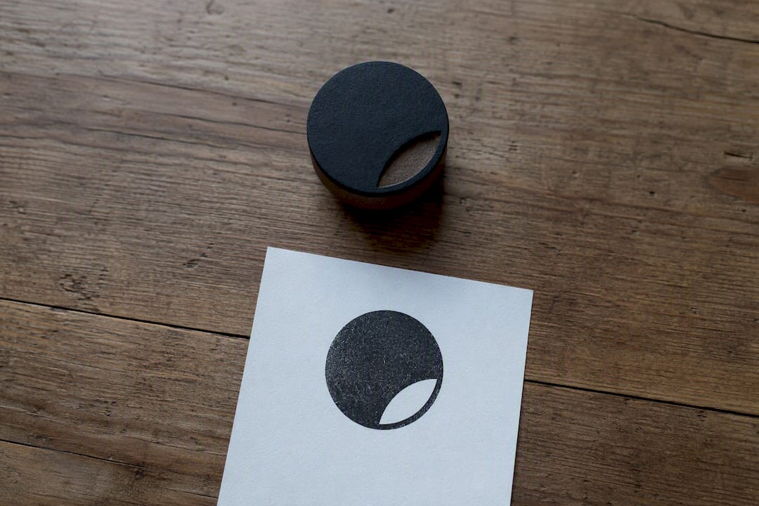
Typography: choose one typeface family and check it at 16 pixels before committing. Thin, decorative fonts often disappear at small sizes.
Common mistakes worth avoiding:
- Cramming in too much detail “to look premium”
- Using three or more colours in the primary mark
- Setting text too small to read on a stamp or favicon
- Copying a trend so closely the mark becomes generic
Pro Tip: To make a simple logo feel original without adding complexity, customise one letterform or one geometric detail, a slightly angled stroke, a deliberate gap, a mirrored curve. One considered tweak signals intention; five decorative flourishes signal indecision.
Using AI to speed up simple logo concepts
AI tools won’t replace your judgement, but they will cut your first-draft time to minutes. Shopify documents how many logo generators ask for your industry, style and name, then produce editable starting points.
- Prompt an AI text tool (ChatGPT or similar) with something like: “Suggest three simple logo concepts for a bakery called Oat & Rye, using a wordmark or abstract mark, two colours maximum.”
- Feed a refined version into an image generator: “Minimalist abstract logo, two colours, flat design, no gradients, works in black and white.”
- Restrict the output deliberately: cap shapes, cap colours, and always request a monochrome variant so the AI can’t hide weaknesses behind colour or shading.
One caution worth flagging: AI-generated marks can unintentionally resemble existing trademarks, so check originality before you commit to a final design.
Exporting, testing and integrating your new logo
A great concept means nothing if it breaks the moment you resize it. Vector formats are non-negotiable for scaling, and testing across real applications catches problems before a client or printer does.
Export checklist:
- SVG for any digital scaling
- PNG for immediate web or social use
- Monochrome EPS or vector file for print and stamping
Test it here:
- Favicon size (16×16 pixels)
- Social media avatar (circular crop)
- Black-and-white conversion
- A printed proof, including embroidered or stamped sizes
Before ordering a stamp, prepare a clean monochrome vector file, that’s the format Stamp Design 4U’s preview process uses to show you exactly how the mark will look imprinted.
Why simple logos work: the research
The numbers: Consumers form a first impression of a logo in about 400 milliseconds, and consistent colour use can lift recognition by up to 80%.
That speed is not an accident. It’s processing fluency at work, the brain rewards shapes it can decode instantly with a sense of familiarity and trust. Familiar logos even carry a measurable edge: research found an 8% search-speed advantage for recognisable marks over unfamiliar ones. Simplicity isn’t the safe choice, it’s the fast one.
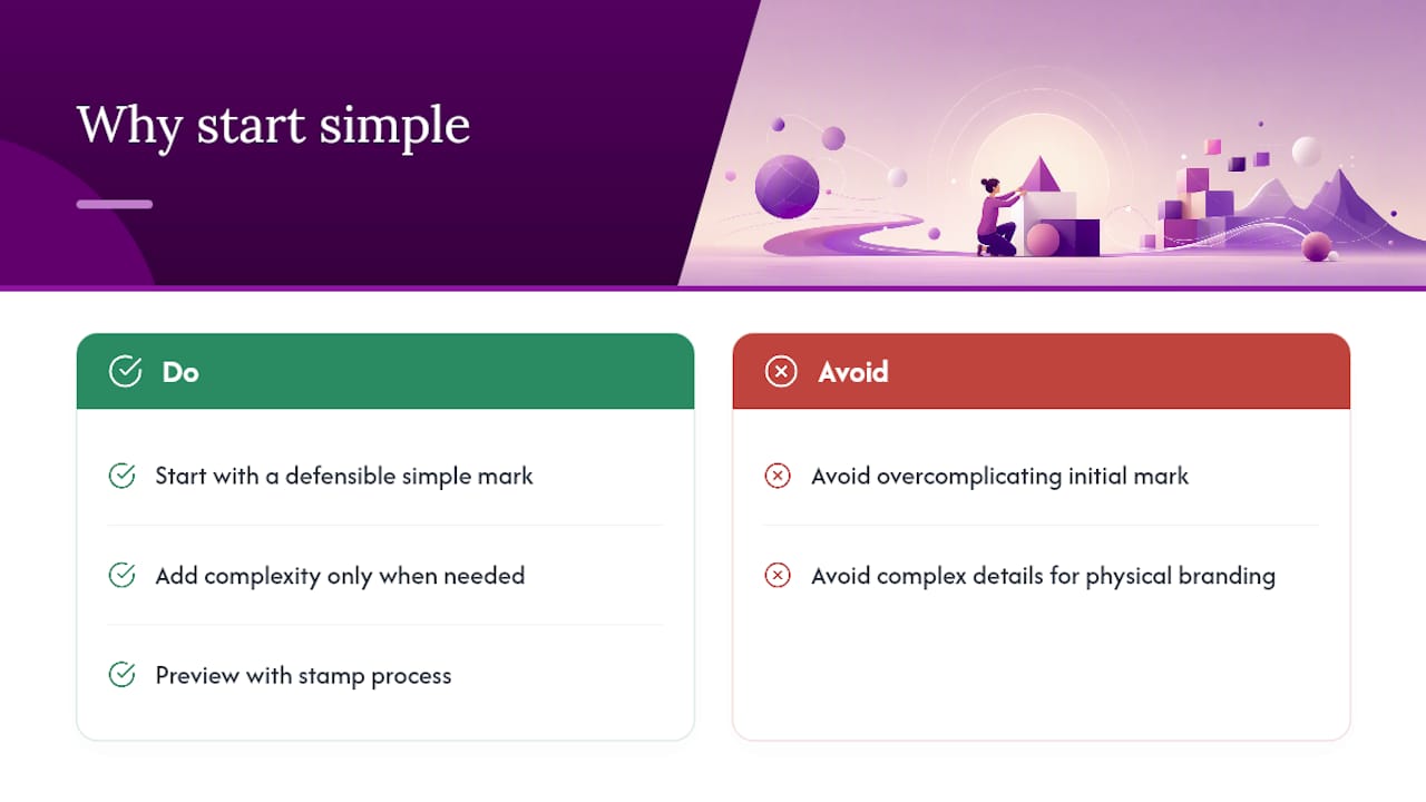
Why start simple
Start with the simplest version of your idea you can defend, then let it earn complexity later if the brand genuinely needs it, as explained in What Is Modern Outdoor Identity for Brand Leaders. A clean mark also translates far better into physical branding, when you preview a design through the Stamp Design 4U stamp process, the ones that survive are always the plainest ones.
A different route to physical branding
Canva, Adobe Express and Pinterest are excellent for building the digital version of your logo, templates, generation, inspiration, but none of them turn that file into something a customer can actually touch. That’s where Stamp Design 4U fits in, not as a rival to those design tools, but as the next step once your simple mark is finished.
Stamp Design 4U takes your exported logo file and turns it into a working rubber stamp, ready for receipts, packaging, or paperwork, with a preview so you see exactly how the imprint will look before you order. It’s a faster route to physical branding than briefing a print shop from scratch, because the artwork upload and stamp preview happen in one place. Small businesses using personalised packaging stamps get consistent branding on every parcel without reordering printed materials each time, and a compact option like the Trodat 4927 logo and text stamp suits anyone who wants their mark alongside business details on one imprint.
If your logo is ready, upload it and preview your stamp today.
Sources
- The importance of colour in your branding — Charity Digital
- PubMed article on brand familiarity and recognition
- How to design a logo — Shopify blog
- Logo design psychology — Inkbot Design
- Logo design tips — Media Village