
TL;DR:
- Effective event stamp design requires bold, simple visuals that withstand physical compression and ink spread. Preparing properly by selecting the surface, software, and production timeline ensures consistent, legible impressions. Testing designs on actual materials before production prevents costly reorders and enhances brand visibility.
The stamp design for events process is defined as the structured sequence of decisions, tools, and production steps required to create a custom rubber stamp that delivers clear, repeatable impressions on event materials. A well-executed custom stamp functions as both a branding asset and a practical tool, appearing on everything from paper bags and tickets to wristbands and packaging. Unlike a generic office stamp, an event stamp must balance artistic intent with physical constraints. Tools such as Adobe Illustrator, stamp manufacturers like Trodat, and specialist UK suppliers including Stampdesign4u each play a distinct role in making that balance achievable.
What prerequisites and tools do you need before starting?
Before a single design element is placed on a canvas, three decisions shape everything that follows: the event theme, the surface you will stamp on, and the intended stamp size. Getting these wrong at the start means redesigning after production, which costs both time and money.
Design software is the foundation of the process:
- Adobe Illustrator is the industry standard for vector artwork, producing clean, scalable lines that translate directly to rubber without distortion.
- Adobe Photoshop suits texture effects such as distressed or aged finishes, though all final artwork should be converted to vector before submission.
- Free alternatives such as Inkscape handle basic vector work for planners without access to Adobe tools.
Stamp mechanism types determine usability at your event:
- Self-inking stamps automatically re-ink after each impression and are suited to high-volume use. Self-inking stamps allow up to 10,000 impressions before refilling, making them practical for busy event environments.
- Pre-inked stamps produce sharper detail and last longer but carry a higher unit cost, making them better suited to lower-volume, premium applications.
- Traditional rubber stamps require a separate ink pad and offer the widest range of ink compatibility.
Ink type must match the stamping surface. Water-based inks work on paper and card. Oil-based inks adhere to glossy or coated surfaces. Fabric inks are heat-set and permanent on textiles, which matters if you are stamping tote bags or cotton wristbands.
Pro Tip: Before ordering, stamp a test impression by hand on the actual surface you plan to use at your event. A surface that looks smooth can behave very differently under pressure, and discovering this before production saves a reorder.
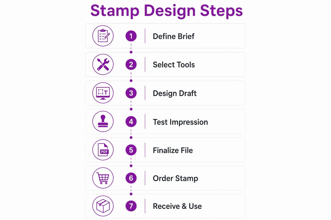
Finally, define your branding strategy in writing before opening any design software. Knowing your colour palette, logo usage rules, and the tone of the event keeps design decisions consistent and speeds up approval from stakeholders.
How do you create a stamp design that is legible and effective?

Effective stamp design follows a clear set of principles, and the most important one is restraint. Fine lines, thin serifs, and intricate detail that look sharp on screen frequently collapse into muddy blobs on rubber. The physical stamping process compresses ink into a surface, and any element thinner than roughly 1mm risks filling in entirely.
Follow these steps to build a design that works in practice:
- Start with the silhouette. Sketch the overall shape of the stamp before adding any detail. A strong silhouette reads clearly even when the interior elements are imperfect.
- Use high-contrast shapes and bold lines. Bold lines and negative space contribute directly to legibility and longevity across thousands of impressions. Negative space is not wasted area. It gives each element room to breathe and prevents ink from bleeding between adjacent shapes.
- Choose fonts deliberately. Slab-serif typefaces such as Rockwell or Clarendon hold their weight at small sizes and project authority. Sans-serif fonts like Futura or Gill Sans read cleanly on curved or slightly uneven surfaces. Avoid script fonts below 14pt as the thin strokes disappear under pressure.
- Adapt the design to the surface texture. Materials like fabric or rough cardboard require larger, bolder elements for clear impressions. If you are stamping kraft paper bags at a festival, increase your minimum line weight and reduce fine detail compared to a design intended for smooth card stock.
- Apply layers and masks in Adobe tools for effects. Using layers and masks in Adobe Illustrator allows precise control over distressing and embossing effects that add character without compromising legibility. A distressed texture can make a stamp feel handcrafted and authentic, which suits artisan or boutique events particularly well.
- Embed fonts as outlines before saving. Embedding fonts as outlines prevents substitution errors during production and ensures the text in your final stamp matches your approved design exactly.
- Print a proof at actual size. Digital previews can be deceptive. Print your design at the exact dimensions of the finished stamp on the intended surface and assess it from arm’s length. If any element is hard to read at that distance, simplify it before submitting to production.
Pro Tip: Reduce your design to greyscale before finalising it. If it reads clearly in black and white, it will translate well to a single-colour stamp impression. Colour on screen hides legibility problems that greyscale exposes immediately.
Balancing artistic ambition with functional constraints is the defining skill in event stamp creation. The most memorable unique event stamps are almost always simpler than their designers originally intended.
What are the key steps in producing and ordering your custom event stamp?
Once the design is finalised, the production workflow follows a predictable sequence. Understanding each stage helps you plan around event deadlines without last-minute pressure.
- Submit in the correct file format. Vector PDF or SVG files are preferred by most stamp manufacturers. These formats preserve line quality at any size and give the manufacturer precise control over the rubber cutting process. Raster files such as JPEG or PNG are acceptable only at very high resolution (minimum 600dpi at final stamp size).
- Review the digital proof carefully. Most manufacturers send a digital proof before cutting. Check size, alignment, text accuracy, and line weight. Do not approve a proof on a phone screen. View it on a monitor at 100% zoom to catch issues that small screens compress.
- Confirm size and shape. Standard rectangular stamps suit most event branding. Custom shapes (circular, oval, or die-cut) cost more and take longer but create a stronger visual impression on promotional materials. The Trodat 4927 stamp, for example, offers a 60 x 40mm print area that accommodates multi-line text and a logo simultaneously.
- Specify ink colour and surface compatibility in writing when placing the order. Manufacturers offer standard colours (black, red, blue) and custom-mixed options. Custom colours typically add two to three working days to production.
- Understand production timelines. Simple promotional stamps often take only days or weeks to produce, which contrasts sharply with institutional projects. For context, Royal Mail’s stamp design process involves committee review and can take two to five years. For event planners, ordering at least two weeks before the event date provides a comfortable buffer for proofing and any corrections.
| Stage | Typical timeframe |
|---|---|
| Design finalisation and file submission | 1 to 3 days |
| Digital proof review and approval | 1 to 2 days |
| Production and cutting | 2 to 5 working days |
| Delivery (standard UK) | 1 to 3 working days |
The custom stamp design workflow from concept to delivery typically spans one to two weeks for straightforward designs, making it entirely achievable even for events with tight lead times.
What common challenges arise, and how do you troubleshoot them?
Even a well-designed stamp can produce poor results if the physical stamping process is not managed correctly. These are the most frequent problems event planners encounter and how to address each one.
- Smudging and double lines are almost always caused by movement during the impression. Pressing straight down and lifting straight up on a flat, firm surface eliminates this. Rocking or twisting the stamp as you lift drags wet ink across the surface.
- Uneven impressions on soft or uneven surfaces require a firm backing. Place a hardback book or cutting board beneath fabric or padded materials before stamping. Without a solid base, pressure distributes unevenly and parts of the design fail to transfer.
- Ink not adhering to the surface signals an ink-to-surface mismatch. Glossy or coated card requires a solvent-based or pigment ink rather than a standard dye-based water ink. Test on a scrap piece of the same material before committing to the full run.
- Muddy or filled-in impressions on the first few uses of a new stamp are normal. Ink the stamp and press several times on scrap paper before real use to remove manufacturing residue and condition the rubber surface.
- Size mismatch between design and stamp area is caught at the proof stage if you review carefully. If the physical stamp arrives smaller than expected, check whether the manufacturer scaled the artwork to fit within a border or margin allowance.
Physical impressions are the only reliable test. A design that looks perfect on screen can fail completely on the intended surface. Always request a physical sample before ordering in quantity for a large event.
For events where custom stamps improve brand visibility, consistent impression quality across every use matters as much as the design itself. A stamp that performs reliably for 500 impressions is more valuable than a beautiful design that smudges after 50.
Key takeaways
A successful stamp design for events process depends on matching the design’s visual weight to the stamping surface, embedding fonts correctly, and allowing adequate production time before the event date.
| Point | Details |
|---|---|
| Surface dictates design weight | Rougher or softer surfaces require bolder lines and larger elements to produce legible impressions. |
| Embed fonts before submission | Converting text to outlines prevents font substitution errors during production. |
| Allow two weeks minimum | Order at least two weeks before your event to accommodate proofing, corrections, and delivery. |
| Condition new stamps first | Press a new stamp on scrap paper several times before use to remove residue and ensure clean impressions. |
| Proof at actual size | Print your design at final stamp dimensions on the real surface to catch legibility issues before production. |
Why simplicity is the most underrated stamp design decision
Event planners frequently arrive at the design stage with ambitious artwork: intricate logos, layered text, fine borders, and detailed illustrations. My consistent observation, working across promotional materials for events of all sizes, is that the stamps that perform best in real conditions are the ones that were simplified at least once before production.
The reason is physical. Rubber compresses. Ink spreads slightly on contact. A 2mm gap between two design elements on screen can close entirely under the pressure of a hand stamp. The best practices for custom stamps consistently point to the same conclusion: bold, simple designs outlast and outperform complex ones across hundreds of impressions.
What I find most planners miss is the value of testing the stamp on every surface it will actually touch at the event, not just the primary one. A stamp that reads perfectly on a paper ticket can look completely different on a kraft bag or a cotton wristband. That five-minute test before the event saves a great deal of frustration on the day.
My advice is to start with the simplest version of your design, get a physical proof, and only add complexity in subsequent events once you understand how your chosen stamp mechanism and ink behave on your specific materials. Restraint in the first iteration is not a creative limitation. It is the decision that makes the stamp actually work.
— Steven
Order your custom event stamp with Stampdesign4u
Stampdesign4u makes the ordering process straightforward for event planners who need quality results without lengthy back-and-forth. You can upload your logo or text directly through the platform, select from a range of stamp sizes and ink colours suited to event branding, and receive a digital proof before production begins. For versatile event use, the Trodat 4927 rubber stamp offers a 60 x 40mm print area that accommodates up to nine lines of text alongside a logo, making it one of the most practical options for event organisers. Fast UK turnaround times and clear file submission guidance mean you can move from approved design to finished stamp well within a two-week event lead time.
FAQ
What file format should I submit for a custom event stamp?
Vector PDF or SVG files are the preferred formats for stamp production. These preserve line quality at any size and give the manufacturer precise control during the cutting process.
How long does it take to produce a custom event stamp?
Simple promotional stamps often take only days or weeks to produce. Allowing two weeks from design submission to delivery provides a safe buffer for proofing and corrections.
What is the difference between self-inking and pre-inked stamps for events?
Self-inking stamps allow up to 10,000 impressions before refilling and suit high-volume event use. Pre-inked stamps produce sharper detail and last longer but cost more, making them better for lower-volume or premium applications.
Why does my stamp produce uneven impressions?
Uneven impressions are usually caused by a soft or unstable surface beneath the material being stamped. Place a firm backing such as a hardback book under the material and press straight down without rocking the stamp.
How do I prevent smudging when stamping at events?
Pressing straight down and lifting straight up on a flat, firm surface prevents smudging. Any rocking or twisting motion during lifting drags wet ink across the surface and creates double lines.