
More than 60 percent of British small businesses rely on personalised branding tools to stand out in a competitive market. Choosing the right rubber stamp can make your paperwork faster and your brand more memorable for customers. Whether you are marking invoices, adding your logo, or confirming signatures, finding a stamp that fits your business needs opens the door to stronger customer engagement and a more professional appearance.
Table of Contents
- Stage 1: Choose the Right Stamp Type for Your Needs
- Stage 2: Draft Unique Text for Your Personalised Stamp
- Stage 3: Select Fonts and Styles to Enhance Readability
- Stage 4: Preview and Refine Your Stamp Design Online
- Stage 5: Verify Text Accuracy Before Ordering
Quick Summary
| Key Point | Explanation |
|---|---|
| 1. Choose the right stamp type | Assess your needs to select a stamp for tasks like addressing or branding to enhance efficiency. |
| 2. Craft concise stamp text | Include essential business details while ensuring clarity and compliance in a visually appealing format. |
| 3. Use legible fonts and styles | Opt for clear, sans serif fonts at appropriate sizes to maintain professionalism and readability. |
| 4. Preview designs digitally | Use online tools to refine and adjust your stamp layout before finalising the design for production. |
| 5. Ensure text accuracy before ordering | Conduct thorough checks on all details to prevent errors that could affect your business’s professional image. |
Stage 1: Choose the Right Stamp Type for Your Needs
Selecting the appropriate rubber stamp for your small business requires careful consideration of your specific operational requirements. Understanding the nuanced differences between stamp types can transform your document processing and brand presentation.
Start by evaluating your primary usage needs. Do you require frequent address stamping, need custom logo impressions, or want signature validation stamps? Each stamp type serves a distinct purpose. Standard business stamp regulations provide crucial guidance on appropriate document marking techniques. For small businesses, versatility and clarity are paramount. Consider self-inking stamps for repeated use, traditional handle stamps for occasional applications, and speciality stamps like date or numbering stamps for specific administrative tasks.
Your stamp selection should align with your professional image and functional requirements. Examine factors such as impression quality, durability, ink colour compatibility, and frequency of use. Stamp duty documentation highlights the importance of precise and professional stamp application across various business contexts.
Expert Recommendation: Invest in a high-quality stamp that offers crisp, consistent impressions and matches your brand’s professional standards.
Here’s a clear comparison of popular rubber stamp types and their ideal uses:
| Stamp Type | Ideal For | Key Benefit |
|---|---|---|
| Self-inking | Frequent stamping tasks | Clean, quick use |
| Traditional handle | Occasional applications | Interchangeable pads |
| Date/numbering stamp | Administrative records | Precise tracking |
| Custom logo stamp | Brand documents | Enhances recognition |
Stage 2: Draft Unique Text for Your Personalised Stamp
Crafting the perfect text for your business stamp requires strategic thinking and attention to detail. Your stamp represents your brand’s professional identity in every document and communication.

Begin by selecting text that clearly communicates your business essentials. Small business naming guidelines recommend creating unique identifiers that distinguish your organisation. Include core information such as your full business name, registration number, or primary contact details. Ensure the text remains concise while providing comprehensive information relevant to your specific business needs. Consider the physical size of your stamp and choose fonts and text sizes that will render clearly and professionally.
Your stamp text should balance legal compliance with branding aesthetics. Regulatory communication standards emphasise the importance of clear and precise documentation. Avoid overcrowding the stamp with unnecessary information, focusing instead on key identifiers that enhance your professional image and facilitate easy business communication.
Expert Recommendation: Test multiple text layouts and fonts before finalising your stamp design to ensure maximum readability and visual appeal.
Stage 3: Select Fonts and Styles to Enhance Readability
Creating a legible and professional stamp requires careful consideration of typography and design elements. Your font selection will directly impact how effectively your business communicates through its personalised stamp.
Government typography guidelines recommend selecting fonts that maintain clarity at small sizes. Sans serif fonts like Arial or Calibri work exceptionally well for stamp text because they provide clean lines and remain readable even when scaled down. Avoid decorative or overly stylised fonts that might compromise legibility. Choose a font size between 8 and 12 points that allows all essential text to fit comfortably within your stamp’s dimensions. Consider using bold or slightly larger font weights for critical information such as business names or registration numbers to ensure they stand out.
When designing your stamp text, prioritise consistency and professionalism. Official style recommendations emphasise maintaining a uniform appearance across all business communications. Select a single font family and maintain consistent text alignment to create a polished and authoritative look. Test your design by printing multiple drafts and examining them at actual stamp size to verify readability and visual impact.
Expert Recommendation: Create a digital proof of your stamp design and view it at 100% scale to confirm text clarity and overall aesthetic.
Stage 4: Preview and Refine Your Stamp Design Online
Bringing your personalised stamp design to life requires strategic online previewing and careful refinement. Digital tools now offer small businesses unprecedented opportunities to perfect their stamp design before committing to production.
Online design preview tools enable businesses to experiment with different layouts and configurations rapidly. Start by uploading your draft text and testing various alignments and font combinations. Ensure you can see a high resolution representation of how your stamp will appear when printed. Pay close attention to text spacing, size proportions, and overall visual balance. Most digital platforms allow you to zoom in and examine minute details that might be challenging to assess on smaller screens.
Design registration services recommend thoroughly checking every element of your stamp design before finalising. Verify that all text is legible at actual stamp size and that critical business information remains clear and professional. Run multiple preview iterations to compare different design approaches. Test how your stamp design looks against various background colours and materials to ensure versatility and consistent readability across different document types.
Expert Recommendation: Always save multiple design versions during your online preview process to track your creative progress and have backup options.
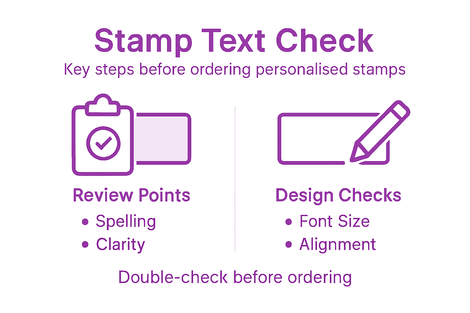
Stage 5: Verify Text Accuracy Before Ordering
Final review of your stamp text represents a critical checkpoint to prevent costly mistakes and ensure professional representation of your business. Precision matters more than you might initially realise.
Professional text verification demands meticulous attention to every character and detail. Read your proposed stamp text aloud and backwards to catch potential spelling or grammatical errors that might slip past a conventional review. Cross reference your business registration documents to confirm legal names, registration numbers, and official contact details are exactly as they appear in your official paperwork. Pay special attention to abbreviations, punctuation, and spacing which can dramatically alter the professional appearance of your stamp.
Academic accuracy standards emphasise the importance of precise information representation. Request a digital proof or printed sample of your stamp design to verify text clarity, alignment, and overall visual impact. Compare this proof against your original design specifications, checking that font sizes, text positioning, and content remain consistent with your initial requirements. Involve a second set of eyes if possible to catch any potential oversights that might compromise your stamp’s professional presentation.
Expert Recommendation: Create a physical checklist of verification points to systematically review every aspect of your stamp text before final submission.
Use this quick checklist to verify your stamp text before ordering:
| Checkpoint | What to Confirm | Why It Matters |
|---|---|---|
| Business details | Legal business name and numbering | Prevents rejection |
| Spelling and grammar | All words accurate and correct | Projects professionalism |
| Font size and alignment | Readable and consistently placed | Ensures clear impression |
| Contact information | Up-to-date phone/email | Enables client response |
Discover Effortless Personalised Stamp Creation for Your Small Business
Personalising your stamp text can feel daunting with so many details to get just right—from selecting the perfect font to ensuring legal business names and contact information display clearly. This article highlights common challenges such as balancing professionalism, readability, and compliance while producing a crisp impression every time. If you want to bring all these essential considerations together without the stress and risk of errors, StampDesign4U offers an intuitive online platform tailored for small businesses seeking high-quality custom stamps.
Take advantage of our easy-to-use design tools that empower you to preview, refine, and order personalised rubber stamps that perfectly match your unique requirements. Whether you need self-inking, traditional handle, or custom logo stamps, our extensive options and expert support ensure your stamp text is accurate and professional from the first impression. Don’t wait until errors derail your branding—visit StampDesign4U main page now and create your flawless customised stamp with confidence today.
Frequently Asked Questions
How do I choose the right text for my personalised stamp?
Selecting the right text involves including your business name, registration number, and contact details clearly. Draft a concise version of your information to ensure it fits comfortably within the stamp’s dimensions.
What fonts should I use for my business stamp text?
Choose sans serif fonts like Arial or Calibri for clarity. Aim for a font size between 8 and 12 points to maintain readability, especially when the stamp is printed.
How can I ensure my stamp design is professional and clear?
Review your design for legibility and consistency in font and alignment. Print multiple drafts of your design to evaluate text clarity and adjust any details as needed before finalisation.
What common mistakes should I avoid when creating stamp text?
Avoid overcrowding your stamp with unnecessary information, which can hinder readability. Double-check for spelling, grammar, and accuracy of your business details to maintain a professional appearance.
How can I verify my stamp text before placing the order?
Read your proposed stamp text aloud and backward to catch errors, and cross-reference it with official documents for accuracy. Consider involving someone else to review the text for an additional layer of verification.
Recommended
- Why Personalise Stamps: Your Complete Guide for 2026 – Stamp Design 4U
- Boost Your Branding: Custom Logo Stamps For Businesses – Stamp Design 4U
- How to Choose the Right Rubber Stamp for Your Business – Stamp Design 4U
- Business Stamp Layout Guide for Effective Branding UK – Stamp Design 4U
- Blogs – YDA UK